Between 2 and 3 years ago I started turning my long time passion for image processing, and particularly morphological image processing, to the task of fault segmentation.
At the time I shared my preliminary code, of which I was very happy, in a Jupyter notebook, which you can run interactively at this GitHub repository.
Two areas need improvement to get that initial workflow closer to a production one. The first one is on the image processing and morphology side; I am thinking of including: a better way to clean-up very short faults; pruning to eliminate spurious segments in the skeletonization result; the von Mises distribution instead of standard distribution to filter low dip angles. I know how to improve all those aspects, and have some code snippets sitting around in various locations on my Mac, but I am not quite ready to push for it.
The second area, on the seismic side, is ability to work with 3D data. This has been a sore spot for some time.
Enter segyio, a fast, open-source library, developed precisely to work with SEGY files. To be fair, segyio has been around for some time, as I very well know from being a member of the Software Underground community (swung), but it was only a month or so ago that I started tinkering with it.
This post is mostly to share back with the community what I’ve learned in my very first playground session (with some very helpful tips from Jørgen Kvalsvik, a fellow member of swung, and one of the creators of segyio), which allowed me to create a 3D fault segmentation volume (and have lots of fun in the process) from a similarity (or discontinuity) volume.
The workflow, which you can run interactively at this segyio-notebooks GitHub repository (look for the 01 – Basic tutorial) is summarized pictorially in Figure 1, and comprises the steps below:
use segy-io to import two seismic volumes in SEGY file format from the F3 dataset, offshore Netherlands, licensed CC-BY-SA: a similarity volume, and an amplitude volume (with dip steered median filter smoothing applied)
manipulate the similarity to create a discontinuity/fault volume
create a fault mask and display a couple of amplitude time slices with superimposed faults
write the fault volume to SEGY file using segy-io, re-using the headers from the input file
Figure 1. Naive 3D seismic fault segmentation workflow in Python.
DISCLAIMER: The steps outlined in the tutorial are not intended as a production-quality fault segmentation workflow. They work reasonably well on the small, clean similarity volume, artfully selected for the occasion, but it is just a simple example.
Use Agile Scientific’s Welly to load two wells with several geophysical logs
Use Pandas, Welly, and NumPy to: remove all logs except for compressional wave velocity (Vp), shear wave velocity (Vs), and density (RHOB); store the wells in individual DataFrames; make the sampling rate common to both wells; check for null values; convert units from imperial to metric; convert slowness to velocity; add a well name column
Split the DataFrame by well using unique values in the well name column
For each group/well use Agile Scientific’s Bruges ‘s Backus average to upscale all curves individually
Add the upscaled curves back to the DataFrame
Matt Hall, (organizer), told me during a breakfast chat on the first day of the sprint that this tutorial would be a very good to have since it is one of the most requested examples by neophyte users of the Bruges library; I was happy to oblige.
The code for the most important bit, the last two items in the above list, is included below:
# Define parameters for the Backus filter
lb = 40 # Backus length in meters
dz = 1.0 # Log sampling interval in meters
# Do the upscaling work
wells_bk=pd.DataFrame()grouped=wells['well'].unique() forwellingrouped:new_df=pd.DataFrame()Vp=np.array(wells.loc[wells['well']==well,'Vp'])Vs=np.array(wells.loc[wells['well']==well,'Vs'])rhob=np.array(wells.loc[wells['well']==well,'RHOB'])Vp_bks,Vs_bks,rhob_bks=br.rockphysics.backus(Vp,Vs,rhob,lb,dz)new_df['Vp_bk']=Vp_bksnew_df['Vs_bk']=Vs_bksnew_df['rhob_bk']=rhob_bkswells_bk=pd.concat([wells_bk,new_df])
# Add to the input DataFrame
wells_final= (np.concatenate((wells.values, wells_bk.values), axis=1))
cols=list(wells) +list(wells_bk)
wells_final_df=pd.DataFrame(wells_final, columns=cols)
And here is a plot comparing the raw and upscaled Vp and Vs logs for one of the wells:
Please check the notebook if you want to try the full example.
In the last post I wrote about what Volodymyr and I worked on during a good portion of day two of the sprint in October, and continued to work on upon our return to Calgary.
In addition to that I also continued to work on a notebook example, started in day one, demonstrating on how to upscale sonic and density logs from more than one log at a time using Bruges ‘ backusand Panda’s groupby. This will be the focus of a future post.
The final thing I did was to write, and test an error_flag function for Bruges. The function calculates the difference between a predicted and a real curve; it flags errors in prediction if the difference between the curves exceeds a user-defined distance (in standard deviation units) from the mean difference. Another option available is to check whether the curves have opposite slopes (for example one increasing, the other decreasing within a specific interval). The result is a binary error log that can then be used to generate QC plots, to evaluate the performance of the prediction processes in a more (it is my hope) insightful way.
The inspiration for this stems from a discussion over coffee I had 5 or 6 years ago with Glenn Larson, a Geophysicist at Devon Energy, about the limitations of (and alternatives to) using a single global score when evaluating the result of seismic inversion against wireline well logs (the ground truth). I’d been holding that in the back of my mind for years, then finally got to it last Fall.
Summary statistics can also be calculated by stratigraphic unit, as demonstrated in the accompanyingJupyter Notebook.
This post and the next one are about the project Volodymyr and I worked on during day two of the sprint, and continued to work on upon our return to Calgary.
First, we wanted to adapt Alessandro’s optimization idea so that it would work with Bruges‘ Inverse Gardner
Second, we wanted to adapt a function from some old work of mine to flag sections of the output velocity log with poor prediction; this would be useful to learn where alpha and beta may need to be tweaked because of changes in the rock lithology or fluid content
I’ll walk you through some of our work. Below are the two functions:
# Alessandro's simple inverse Gardner
def inv_gardner(rho, alpha, beta):
    return (rho/alpha)**(1/beta)

# Bruges' inverse Gardner
def inverse_gardner(rho, alpha=310, beta=0.25, fps=False):
    """
    Computes Gardner's density prediction from P-wave velocity.
    Args:
        rho (ndarray): Density in kg/m^3.
        alpha (float): The factor, 310 for m/s and 230 for fps.
        beta (float): The exponent, usually 0.25.
        fps (bool): Set to true for FPS and the equation will use the typical
            value for alpha. Overrides value for alpha, so if you want to use
            your own alpha, regardless of units, set this to False.
        Returns:
            ndarray: Vp estimate in m/s.
    """
    alpha = 230 if fps else alpha
    exponent = 1 / beta
    factor = 1 / alpha**exponent
    return factor * rho**exponent
They look similarly structured, and take the same arguments. We can test them by passing a single density value and alpha/beta pair.
Good. So the next logical step would be to define some model density and velocity data (shamelessly taken from Alessandro’s notebook, except we now use Bruges’ Gardner with S.I. units) and pass the data, and Bruges’ inverse Gardner toscipy.curve_fit to see if it does just work; could it be that simple?
# Make up random velocity and density with Bruges' direct Gardner
vp_test = numpy.linspace(1500, 5500)
rho_test = gardner(vp_test, 310, 0.25)
noise = numpy.random.uniform(0.1, 0.3, vp_test.shape)*1000
rho_test = rho_test + noise
The next block is only slightly different from Alessandro’s notebook. Instead of using all data, we splits both density and velocity into two pairs of arrays: a rho12 and vp2 to optimize foralpha and beta, a rho1 for calculating “unknown” velocities vp_calc1 further down; the last one, v1, will be used just to show where the real data might have been had we not had to calculate it.
idx = np.arange(len(vp_test))
np.random.seed(3)
spl1 = np.random.randint(0, len(vp_test), 15)
spl2 = np.setxor1d(idx,spl1)
rho1 = rho_test[spl1]
rho2 = rho_test[spl2]
vp1= vp_test[spl1] # this we pretend we do not have
vp2= vp_test[spl2]
Now, as in Alessandro’s notebook, we pass simple inverse Gardner function to scipy.curve_fit to find optimal alpha and beta parameters, and we printalpha and beta.
That is odd, we do not get the same parameters; additionally, there’s this error message:
../scipy/optimize/minpack.py:794:
OptimizeWarning: Covariance of the parameters could not be estimated
category=OptimizeWarning)
One possible explanation is that although both inv_gardner and inverse_gardner take three parameters, perhaps scipy.curve_fit does not know to expect it because in the latter alpha and betaare pre-assigned.
The workaround for this was to write a wrapper function to ‘map’ between the call signature of scipy.curve_fit and that of inverse_gardner so that it would be ‘communicated’ to the former explicitly.
Last weekend I went to California to attend my first ever Python sprint, which was organized at MAZ Café con leche (Santa Ana) by Agile Scientific.
For me this event was a success in many respects. First of all, I wanted to spend some dedicated time working on an open source project, rather than chipping away at it once in a while. Also, participating in a project that was not my own seemed like a good way to challenge myself, by pushing me out of a zone of comfort. Finally, this was an opportunity to engage with other members of the Software Underground Slack team, some of which (for example Jesper Dramsch and Brendon Hall) I’ve known for some time but actually never met in person.
Please read about the Sprint in general on Matt Hall‘s blog post, Café con leche. My post is a short summary of what I did on the first day.
After a tasty breakfast, and at least a good hour of socializing, I sat at a table with three other people interested in working on Bruges (Agile’s Python library for Geophysics) : Jesper Dramsch, Adriana Gordon and Volodymyr Vragov.
As I tweeted that evening, we had a light-hearted start, but then we set to work.
While Adriana and Jesper tackled Bruges’ documentation, which was sorely needed, Volodymyr spent some hours on example notebooks from in-Bruges (a tour of Bruges), which needed fixing, and also on setting up our joint project for day 2 (more in the next post). For my part, I put together a tutorial notebooks on how to use Bruges’ functions on wireline logs stored in a Pandas DataFrame. According to Matt, this is requested quite often, so it seemed like a good choice.
Let’s say that a number of wells are stored in a DataFrame with both a depth column, and a well name column, in addition to log curves.
The logic for operating on logs individually is this:
Split the wells in the DataFrame using groupby, then
for each well
for each of the logs of interest
do something using one of Bruges’ functions (for example apply a rolling mean)
The code to do that is surprisingly simple, once you’ve figure it out (I myself struggle often, and not little with Pandas at the outset of new projects).
One has to first create a list with the logs of interest, like so:
logs=['GR','RHOB']
then define the length of the window for the rolling operation:
Understanding classification with Support Vector Machines
Support Vector Machines are a popular type of algorithm used in classification, which is the process of “…identifying to which of a set of categories (sub-populations) a new observation belongs (source: Wikipedia).
In classification, the output variable is a category, for example ‘sand’, or ‘shale’, and the main task of the process is the creation of a dividing boundary between the classes. This boundary will be a line in a bi-dimensional space (only two features used to classify), a surface in a three dimensional space (three features), and a hyper-plane in a higher- dimensional space. In this article I will use interchangeably the terms hyper-plane, boundary, and decision surface.
Defining the boundary may sound like a simple task, especially with two features (a bidimensional scatterplot), but it underlines the important concept of generalization, as pointed out by Jake VanderPlas in his Introduction to Scikit-Learn, because ”… in drawing this separating line, we have learned a model which can generalize to new data: if you were to drop a new point onto the plane which is unlabeled, this algorithm could now predict…” the class it belongs to.
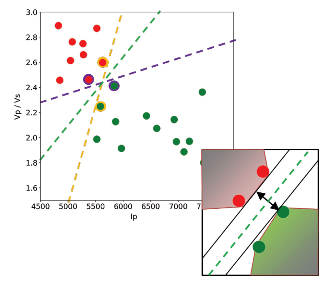
Let’s use a toy classification problem to understand in more detail how in practice SVMs achieve the class separation and find the hyperplane. In the figure below I show an idealized version (with far fewer points) of a Vp/Vs ratio versus P-impedance crossplot from Amato del Monte (2017, Seismic rock physics, tutorial on The Leading Edge). I’ve added three possible boundaries (dashed lines) separating the two classes.
Each boundary is valid, but are they equally good? Well, for the SVM classifier, they are not because the classifier looks for the boundary with the largest distance from the nearest point in either of the classes.
These points, called Support Vectors, are the most representative of each class, and typically the most difficult to classify. They are also the only ones that matter; if a Support Vector is moved, the boundary will also move. However, if any other point is moved, provided that it is not moved into the margin or across the boundary, it would have no effect on the boundary. This makes SVM classifiers insensitive to outliers (points very far away from the rest of the points in their class and from the boundary) and also less memory intensive than other classifiers (for example, the perceptron). The process of finding this boundary is referred to as “maximizing the margin”, where the margin is a corridor with no data points between the boundary and the support vectors. The larger this buffer, the lower the generalization error; conversely, small margins are almost invariably associated with over-fitting. We will see more on this in a subsequent section.
So, to go back to the question, which of the three proposed boundaries is the best one (and by “best” I am referring to the one that will generalize better to unseen data)? Based on what we’ve learned so far, it would have to be the green boundary. Indeed, the orange one is so close to its support vectors (the two points circled with orange) that it leaves virtually no margin; the purple boundary is slightly better (the support vectors are the points circled with purple) but its margin is still quite small compared to the green boundary.
Maximizing the margin is the goal of the SVM classifier, and it is a constrained optimization problem. I refer interested readers to Hearst (1998, Support Vector Machines, IEEE Intelligent Systems); however, I will quote a definition from that paper (with reference to Figure 1 and accompanying text) as it yields further understanding: “… the optimal hyper-plane is orthogonal to the shortest line connecting the convex hulls of the two classes, and intersects it half way”.
In the inset in the figure, I zoomed closer to the 4 points near the green boundary; I’ve also drawn the convex hulls for the classes, the margin, and the shortest orthogonal line, which is bisected by the hyper-plane. I have selected (by hand) the best hyper-plane already (the green one), but if you can imagine rotating a line to span all possible orientations in the empty space close to the two classes without intersecting either of the hulls and find the one with the largest margin, you’ve just done quadratic optimization in your head. Moreover, you’ve turned a crossplot into a decision surface (quoted from Sebastian Thrun, Intro to Machine Learning, Udacity 120 course).
If you are interested in learning more about Support Vector Machines in an intuitive way, and then how to try classification in practice (using Python and the Scikit-learn library), read the full article here, check the GitHub repo, then read How good is what?(blog post by Evan Bianco of Agile Scientific) for an example and DIY evaluation of classifier performance.
Last year, in a post titled Unweaving the rainbow, Matt Hall described our joint attempt to make a Python tool for recovering digital data from scientific images (and seismic sections in particular), without any prior knowledge of the colormap. Please check our GitHub repositoryfor the code and slides, andwatch Matt’s talk (very insightful and very entertaining) from the 2017 Calgary Geoconvention below:
One way to use the app is to get an image with unknown, possibly awful colormap, get the data, and re-plot it with a good one.
Matt followed up on colormaps with a more recent post titled No more rainbows! where he relentlessly demonstrates the superiority of perceptual colormaps for subsurface data. Check his wonderful Jupyter notebook.
So it might come as a surprise to some, but this post is a lifesaver for those that really do like rainbow-like colormaps. I discuss a Python method to equalize colormaps so as to render them perceptual. The method is based in part on ideas from Peter Kovesi’s must-read paper – Good Colour Maps: How to Design Them – and the Matlab function equalisecolormap, and in part on ideas from some old experiments of mine, described here, and a Matlab prototype code (more details in the notebook for this post).
Let’s get started. Below is a time structure map for a horizon in the Penobscot 3D survey(offshore Nova Scotia, licensed CC-BY-SA by dGB Earth Sciences and The Government of Nova Scotia). Can you clearly identify the discontinuities in the southern portion of the map? No?
OK, let me help you. Below I am showing the map resulting from running a Sobel filter on the horizon.
This is much better, right? But the truth is that the discontinuities are right there in the original data; some, however, are very hard to see because of the colormap used (nipy spectral, one of the many Matplotlib cmaps), which introduces perceptual artifacts, most notably in the green-to-cyan portion.
In the figure below, in the first panel (from the top) I show a plot of the colormap’s Lightness value (obtained converting a 256-sample nipy spectral colormap from RGB to Lab) for each sample; the line is coloured by the original RGB colour. This erratic Lightness profile highlights the issue with this colormap: the curve gradient changes magnitude several times, indicating a nonuniform perceptual distance between samples.
In the second panel, I show a plot of the cumulative sample-to-sample Lightness contrast differences, again coloured by the original RGB colours in the colormap. This is the best plot to look at because flat spots in the cumulative curve correspond to perceptual flat spots in the map, which is where the discontinuities become hard to see. Notice how the green-to-cyan portion of this curve is virtually horizontal!
That’s it, it is simply a matter of very low, artificially induced perceptual contrast.
Solutions to this problem: the obvious one is to Other NOT use this type of colormaps (you can learn much about which are good perceptually, and which are not, in here); a possible alternative is to fix them. This can be done by re-sampling the cumulative curve so as to give it constant slope (or constant perceptual contrast). The irregularly spaced dots at the bottom (in the same second panel) show the re-sampling locations, which are much farther apart in the perceptually flat areas and much closer in the more dipping areas.
The third panel shows the resulting constant (and regularly sampled) cumulative Lightness contrast differences, and the forth and last the final Lightness profile which is now composed of segments with equal Lightness gradient (in absolute value).
Here is the structure map for the Penobscot horizon using the nipy spectum before and after equalization on top of each other, to facilitate comparison. I think this method works rather well, and it will allow continued use of their favourite rainbow and rainbow-like colormaps by hard core aficionados.
Yesterday during my lunch break I was rather bored; it is unseasonably cold for the fall, even in Calgary, and a bit foggy too.
For something to do I browsed the Earth Science beta on Stack Exchange looking for interesting questions (as an aside, I encourage readers to look at the unanswered questions).
There was one that piqued my curiosity, “In the northern hemisphere only, what percentage of the surface is land?”.
It occurred to me that I could get together an answer using an equal area projection map and a few lines of Python code; and indeed in 15 minutes I whipped-up this workflow:
Invert and import this B/W image of equal area projection (Peters) for the Northern hemisphere (land = white pixels).


