

This post is a short extract, with minor modifications, from my recently released article on the check the CSEG Recorder Machine Learning in Geoscience V: Introduction to Classification with SVMs.
Understanding classification with Support Vector Machines
Support Vector Machines are a popular type of algorithm used in classification, which is the process of “…identifying to which of a set of categories (sub-populations) a new observation belongs (source: Wikipedia).
In classification, the output variable is a category, for example ‘sand’, or ‘shale’, and the main task of the process is the creation of a dividing boundary between the classes. This boundary will be a line in a bi-dimensional space (only two features used to classify), a surface in a three dimensional space (three features), and a hyper-plane in a higher- dimensional space. In this article I will use interchangeably the terms hyper-plane, boundary, and decision surface.
Defining the boundary may sound like a simple task, especially with two features (a bidimensional scatterplot), but it underlines the important concept of generalization, as pointed out by Jake VanderPlas in his Introduction to Scikit-Learn, because ”… in drawing this separating line, we have learned a model which can generalize to new data: if you were to drop a new point onto the plane which is unlabeled, this algorithm could now predict…” the class it belongs to.
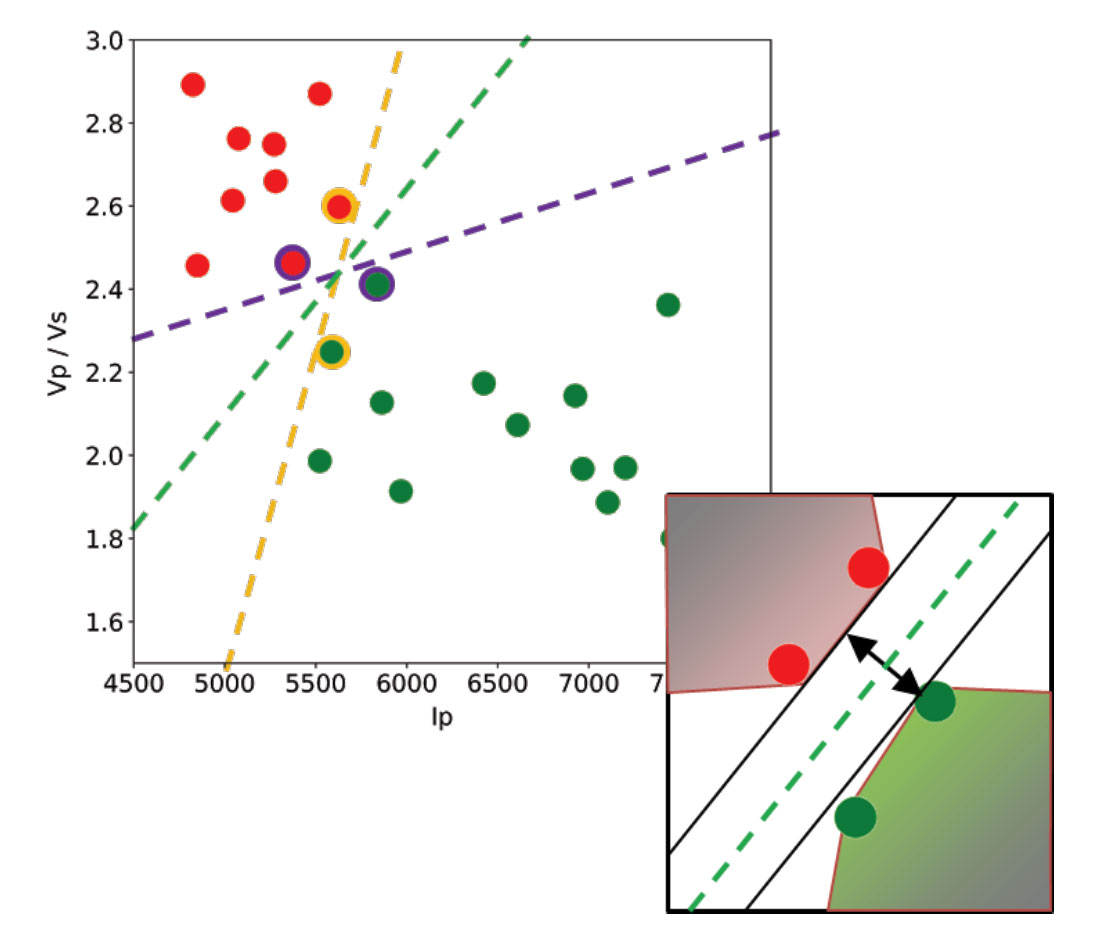
Let’s use a toy classification problem to understand in more detail how in practice SVMs achieve the class separation and find the hyperplane. In the figure below I show an idealized version (with far fewer points) of a Vp/Vs ratio versus P-impedance crossplot from Amato del Monte (2017, Seismic rock physics, tutorial on The Leading Edge). I’ve added three possible boundaries (dashed lines) separating the two classes.


Each boundary is valid, but are they equally good? Well, for the SVM classifier, they are not because the classifier looks for the boundary with the largest distance from the nearest point in either of the classes.
These points, called Support Vectors, are the most representative of each class, and typically the most difficult to classify. They are also the only ones that matter; if a Support Vector is moved, the boundary will also move. However, if any other point is moved, provided that it is not moved into the margin or across the boundary, it would have no effect on the boundary. This makes SVM classifiers insensitive to outliers (points very far away from the rest of the points in their class and from the boundary) and also less memory intensive than other classifiers (for example, the perceptron). The process of finding this boundary is referred to as “maximizing the margin”, where the margin is a corridor with no data points between the boundary and the support vectors. The larger this buffer, the lower the generalization error; conversely, small margins are almost invariably associated with over-fitting. We will see more on this in a subsequent section.
So, to go back to the question, which of the three proposed boundaries is the best one (and by “best” I am referring to the one that will generalize better to unseen data)? Based on what we’ve learned so far, it would have to be the green boundary. Indeed, the orange one is so close to its support vectors (the two points circled with orange) that it leaves virtually no margin; the purple boundary is slightly better (the support vectors are the points circled with purple) but its margin is still quite small compared to the green boundary.
Maximizing the margin is the goal of the SVM classifier, and it is a constrained optimization problem. I refer interested readers to Hearst (1998, Support Vector Machines, IEEE Intelligent Systems); however, I will quote a definition from that paper (with reference to Figure 1 and accompanying text) as it yields further understanding: “… the optimal hyper-plane is orthogonal to the shortest line connecting the convex hulls of the two classes, and intersects it half way”.
In the inset in the figure, I zoomed closer to the 4 points near the green boundary; I’ve also drawn the convex hulls for the classes, the margin, and the shortest orthogonal line, which is bisected by the hyper-plane. I have selected (by hand) the best hyper-plane already (the green one), but if you can imagine rotating a line to span all possible orientations in the empty space close to the two classes without intersecting either of the hulls and find the one with the largest margin, you’ve just done quadratic optimization in your head. Moreover, you’ve turned a crossplot into a decision surface (quoted from Sebastian Thrun, Intro to Machine Learning, Udacity 120 course).
If you are interested in learning more about Support Vector Machines in an intuitive way, and then how to try classification in practice (using Python and the Scikit-learn library), read the full article here, check the GitHub repo, then read How good is what? (blog post by Evan Bianco of Agile Scientific) for an example and DIY evaluation of classifier performance.


