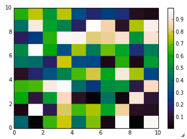
Steve Eddins of the Matwork just published a post announcing a new Matlab colormap to replace Jet. It is called Parula (more to come on his blog about this intriguing name).
First impression: Parula looks good.
And while I haven’t had time to take it into Python to run a full perceptual test and into ImageJ for a colour blindness test, as a preliminary test I did convert it to grayscale with an online picture converting tool that uses the lightness information to perform the conversion (instad of just desaturating the colors) and the result shows monotonic changes in gray.
Since then Giuliano has been kind enough to provide me with the data for one of his spectrograms, so I am resuming the discussion. Below here is a set of 5 figures generated in Matlab from the same data using different colormaps. With this post I’d like to get readers involved and ask to cast your vote for the colormap you prefer, and even drop a line in the comments section to tell us the reason for your preference.
In the second post I’ll show the data displayed with the same 5 colormaps but using a different type of visualization, which will reveal what our brain is doing with the colours (without our full knowledge and consent), and then I will ask again to vote for your favourite.
Evan Bianco of Agile Geoscience wrote a wonderful post on how to use python to import, manipulate, and display digital elevation data for Mt St Helens before and after the infamous 1980 eruption. He also calculated the difference between the two surfaces to calculate the volume that was lost because of the eruption to further showcase Python’s capabilities. I encourage readers to go through the extended version of the exercise by downloading his iPython Notebook and the two data files here and here.
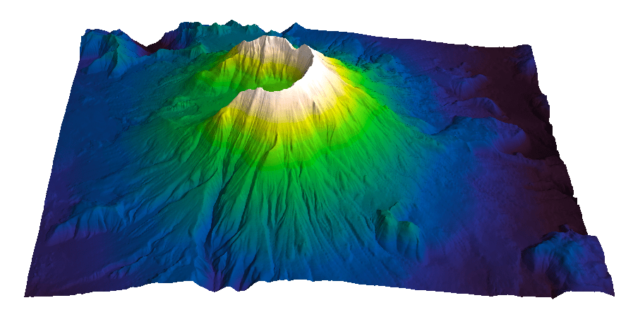
I particularly like Evan’s final visualization (consisting of stacked before eruption, difference, and after eruption surfaces) which he created in Mayavi, a 3D data visualization module for Python. So much so that I am going to piggy back on his work, and show how to import a custom palette in Mayavi, and use it to color one of the surfaces.
Python Code
This first code block imports the linear Lightness palette. Please refer to my last post for instructions on where to download the file from.
import numpy as np
# load 256 RGB triplets in 0-1 range:
LinL = np.loadtxt('Linear_L_0-1.txt')
# create r, g, and b 1D arrays:
r=LinL[:,0]
g=LinL[:,1]
b=LinL[:,2]
# create R,G,B, and ALPHA 256*4 array in 0-255 range:
r255=np.array([floor(255*x) for x in r],dtype=np.int)
g255=np.array([floor(255*x) for x in g],dtype=np.int)
b255=np.array([floor(255*x) for x in b],dtype=np.int)
a255=np.ones((256), dtype=np.int); a255 *= 255;
RGBA255=zip(r255,g255,b255,a255)
This code block imports the palette into Mayavi and uses it to color the Mt St Helens after the eruption surface. You will need to have run part of Evan’s code to get the data.
from mayavi import mlab
# create a figure with white background
mlab.figure(bgcolor=(1, 1, 1))
# create surface and passes it to variable surf
surf=mlab.surf(after, warp_scale=0.2)
# import palette
surf.module_manager.scalar_lut_manager.lut.table = RGBA255
# push updates to the figure
mlab.draw()
mlab.show()
You can use the code snippets in here or download the iPython notebook from here (*** please see update ***). You will need NumPy in addition to Matplotlib.
*** UPDATE ***
Fellow Pythonista Matt Hall of Agile Geoscience extended this work – see comment below to include more flexible import of the data and formatting routines, and code to reverse the colormap. Please use Matt’s expanded iPython notebook.
Preliminaries
First of all, get the color palettes in plain ASCII format rom this page. Download the .odt file for the RGB range 0-1 colors, change the file extension to .zip, and unzip it. Next, open the file Linear_L_0-1, which contains comma separated values, replace commas with tabs, and save as .txt file. That’s it, the rest is in Python.
Code snippets – importing data
Let’s bring in numpy and matplotlib:
%pylab inline
import numpy as np
%matplotlib inline
import matplotlib.pyplot as plt
Now we load the data. We get RGB triplets from tabs delimited text file. Values are expected in the 0-1 range, not 0-255 range.
which is the format required to make the colormap using matplotlib.colors. Here’s the code:
b3=LinL[:,2] # value of blue at sample n
b2=LinL[:,2] # value of blue at sample n
b1=linspace(0,1,len(b2)) # position of sample n - ranges from 0 to 1

# setting up columns for list
g3=LinL[:,1]
g2=LinL[:,1]
g1=linspace(0,1,len(g2))

r3=LinL[:,0]
r2=LinL[:,0]
r1=linspace(0,1,len(r2))

# creating list
R=zip(r1,r2,r3)
G=zip(g1,g2,g3)
B=zip(b1,b2,b3)

# transposing list
RGB=zip(R,G,B)
rgb=zip(*RGB)
# print rgb

# creating dictionary
k=['red', 'green', 'blue']
LinearL=dict(zip(k,rgb)) # makes a dictionary from 2 lists
which gives you this result: Notice that if the original file hadn’t had 256 samples, and you wanted a 256 sample color palette, you’d use the line below instead:
For getting maps and art together, I thought it could not be topped. Then today, I stumbled into NASA’s Perpetual Ocean animation: beautiful!
From the original Source: This is an animation of ocean surface currents from June 2005 to December 2007 from NASA satellites. Watch how bigger currents like the Gulf Stream in the Atlantic Ocean and the Kuroshio in the Pacific carry warm waters across thousands of miles at speeds greater than four miles per hour (six kilometers per hour); how coastal currents like the Agulhas in the Southern Hemisphere move equatorial waters toward Earth’s poles; and how thousands of other ocean currents are confined to particular regions and form slow-moving, circular pools called eddies. Credit: NASA/SVS
Related sites
More media options, including a 20 minute version at 30 fps can be found here
If you’d like to try it, once on the viewer you can load an overlay and then you can choose from among several color palettes. The perceptual rainbow palette is listed here as “Rainbow 2”.
This is really exciting news as NASA’s adoption will increase the palette’s exposure and its chances of becoming more mainstream. This is also as close as I will ever get to realizing my childhood dream of becoming an astronaut. Thanks ESDIS, and thanks Ryan, on both accounts.
In a future posts I will take a look at some of the color palettes used for seismic amplitude display, and discuss ways we can design more perceptual and more efficient ones.
For now, I would like to ask readers to look at two sets of seismic images and answer the survey questions in each section. Far from being exhaustive sets, these are meant as a teaser to get a conversation started and exchange opinions and preferences.
Stratigraphic interpretation
The seismic line below is inline 424 from the F3 dataset, offshore Netherlands from the Open Seismic Repository (licensed CC-BY-SA).
I generated an animation, played at 0.5 frames/second, where 8 different color palette are alternated in sequence. Please click on the image to see a full resolution animation. I also generated a 0.25 frame/second version and a 1 frame/second version.
The images used to create the panel below are portions of seismic displays kindly provided by Steve Lynch of 3rd Science Solutions, generated using data released by PeruPetro. I am grateful to both.