Quick post to share my replica of Ethan Montag ‘s Spectral lightness colormap from this paper. My version has a linear Lightness profile (Figure 1) that increases monotonically from 0 (black) to 100 (white) while Hue cycles from 180 to 360 degrees and then wraps around and continues from 0 to 270.
You can download the colormap files (comma separated in MS Word .doc format) with RGB values in 0-1 range and 0-255 range.
Figure 1
Figure 2
Matlab code
To run this code you will need Colorspace, a free function from Matlab File Exchange, for the color space transformations.
In the comment section of my last post Steve Eddins from Mathworks reported that some Matlab users prefer Jet to Parula, the new default perceptual colormap in Matlab, because within certain ranges Jet affords a greater contrast, intended as the rate of change in lightness.
My counter-argument to that is that yes, some data may benefit from being displayed using Jet (in terms of contrast, and hence the power to resolve smaller anomalies) because of those areas of very steep rate of change of lightness, like the blue to cyan and yellow to red portions (see Figure 1). But the price one has to pay is that there is an area of very low gradient (a greenish band between cyan and yellow) where there’s nearly no contrast, which would obfuscate subtle anomalies in the data. On top of that there’s no control of where each of those areas are located, so a lot of effort has to go into trying to fit those regions of artificially high contrast to the portion of data of interest.
Figure 1
Because of their high lightness, the yellow and cyan artificial edges also cause problems. In his latest blog post Steve uses a test pattern do demonstrate how they make the interpretation of trivial structures more difficult. He also explains why they occurr in some locations and not others in the first place. I wonder if the resulting regions of high lightness juxtaposed to regions of low lightness could be chromatic Mach bands.
Additionally, as Steve points out, the low-contrast juxtaposition of dark red and dark blue bands creates the visual illusion of depth (Chromostereopsis) in other positions of the test pattern, creating further confusion.
But I have some good news for the hardcore fans of Jet, and rainbow colormaps in general. I created a rainbow with a sawtooth-shaped lightness profile made up of 5 ramps, each with the same rate of change in lightness and total lightness change of 60, and alternatively negative and positive signs. This is shown in Figure 2, and replaces the lightness profile of a basic 6-color rainbow (magenta-blue-cyan-green-yellow-red) shown in Figure 3.
Figure 2
Figure 3
With this rainbow users have the ability to apply greater contrast to their data to boost small anomalies, but in a more controlled way. The colormap is available with my File Exchange function, Perceptually improved colormaps. Below is the Matlab code I used to generate the new rainbow.
Matlab code
To run this code you will need Colorspace, a free function from Matlab File Exchange, for the color space transformations.
%% basic 6-colour rainbow
% create RGB components
m = [1, 0, 1]; % magenta
b = [0, 0, 1]; % blue
c = [0, 1, 1]; % cyan
g = [0, 1, 0]; % green
y = [1, 1, 0]; % yellow
r = [1, 0, 0]; % red
% concatenate components
rgb = vertcat(m,b,c,g,y,r);
% interpolate to 256 colours
rainbow=interp1(linspace(1, 256, 6),rgb,[1:1:256]);
%% calculate Lab components
% convert from RGB to Lab colour space
% requires this function: Colorspace transforamtions
% www.mathworks.com/matlabcentral/fileexchange/28790-colorspace-transformations
lab = colorspace('RGB->Lab',rainbow);
%% replace random lightness profile with sawtooth-shaped profile
% contrast (magnitude of lightness change) between
% each pair of adjeacent colors set to 60
L1 = [90, 30, 90, 30, 90, 30];
% interpolate to 256 lightness values
L1int = interp1(linspace(1, 256, 6),L1,[1:1:256])';
% replace
lab1 = horzcat(L1int,lab(:,2),lab(:,3));
%% new rainbow
% convert back from Lab to RGB colour space
swtth = colorspace('RGB<-Lab',lab1);
Test results
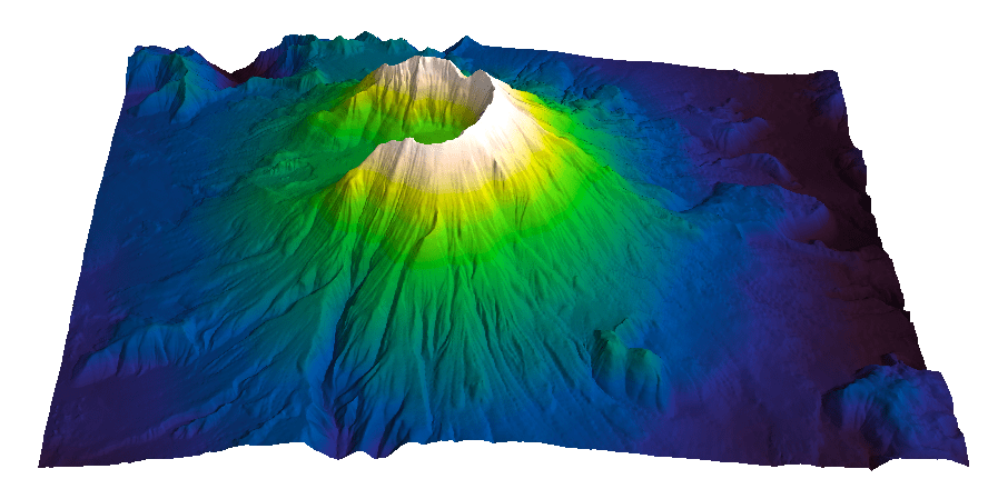
Figures 4, 5, and 6 show the three colormaps used with my Pyramid test surface (notice in Figure 5 that the green band artifact with this rainbow is even more pronounced than with jet). I welcome feedback.
Figure 4
Figure 5
Figure 6
Aknowledgements
The coloured lightness profiles were made using the Colormapline submission from the Matlab File Exchange.
I recently added to my Matlab File Exchange function, Perceptually improved colormaps, a colormap for periodic data like azimuth or phase. I am going to briefly showcase it using data from my degree thesis in geology, which I used before, for example in Visualization tips for geoscientists – Matlab. Figure 1, from that post, shows residual gravity anomalies in milligals.
Figure 1
Often we’re interested in characterizing these anomalies by calculating the direction of maximum dip at each point on the surface, and for that direction display the azimuth, or dip azimuth. I’ve done this for the surface of residual anomalies from Figure 1 and displayed the azimuth in Figure 2. Azimuth from 0 to 360 degrees are color-coded using Jet, Matlab’s standard colormap (until recently). Typically I do not trust azimuth values when the dip is close to zero because it is often contaminated by noise so I would use shading to de-saturate the colors where dip has the lowest values, but for ease of discussion I haven’t done so in this case.
Figure 2. Azimuth values color-coded with Jet.
There are two problems with Figure 2. First, the well-known problems with the jet colormap. For example, blue is too dark and blue areas appear as bands of constant colour. Yellow is much lighter than any other colour so we see artificial yellow edges that are not really present in the data. But there is an additional issue in Figure 2 because azimuths close in value to 0 and 360 degrees are colored with blue and red, respectively, instead of a single color as they should, causing an additional artificial edge.
In Figure 3 I recolored the map using a colormap that replicates those used in many geophysical software tools to display azimuth or phase data. This is better because it wraps around at 360 degrees but the perceptual issues are unresolved: in this case red, yellow and blue all appear as sharp perceptual edges.
Figure 3. Azimuth values color-coded with generic azimuth colormap.
Figure 4. Azimuth values color-coded with isoluminant azimuth colormap.
In Figure 4 I used my new colormap, called isoAZ (for isoluminant azimuth). This colormap is much better because not only does it wraps around at 360 degrees, but also lightness is held constant for all colors, which eliminates the perceptual anomalies. All the artificial yellow, red, and blue edges are gone, only real edges are left. This can be more easily appreciated in the figure below: if you hover with your mouse over it you are able to switch back and forth between Figure 3 and Figure 4.
From an interpretation point of view, azimuths 180 degrees apart are of opposing colours, which is ideal for dip azimuth data because it allows us to easily recognize folds where dips of opposite direction are juxtaposed at an edge. One example is the sharp edge in the northwest quadrant of Figure 4, where magenta is juxtaposed to green. If you look at Figure 1 you see that there’s a relative high in this area (the edge in Figure 4) with dips of opposite direction on either side (East and West, or 0 and 360 degrees).
The colormap was created in the Lightness-Chroma-Hue color space, a polar transform of the Lab color space, where lightness is the vertical axis and at each value of lightness, chroma is the radial coordinate and hue the polar angle. One limitation of this approach is that due to theirregular shape of the color gamut section at each lightness value, we can never exceed chroma values of about 38-40 (at lightness = 65 in Matlab; in Python, with extensive trial and error, I have not been able to go past 36 using the Scikit-image Color module), which make the resulting colors pale, pastely.
it creates For those that want to experiment with it further, I used just a few lines of code similar to the ones below:
radius = 38; % chroma
theta = linspace(0, 2*pi, 256)'; % hue
a = radius * cos(theta);
b = radius * sin(theta);
L = (ones(1, 256)*65)'; % lightness
Lab = [L, a, b];
RGB=colorspace('RGB<-Lab',Lab(end:-1:1,:));
This code is a modification from an example by Steve Eddins on a post on his Matlab Central blog. In Steve’s example the colormap cycles through the hues as lightness increases monotonically (which by the way is an excellent way to generate a perceptual rainbow). In this case lightness is kept constant and hue cycles through the entire 360 degrees and wraps around. Also, instead of using the Image Processing Toolbox, I used Colorspace, a free function from Matlab File Exchange, for the color space transformations.
For data like fracture orientation where azimuths 180 degrees apart are equivalent it is better to stack two of these isoluminant colormaps in a row. In this way we place opposing colors 90 degrees apart, whereas color 180 degrees apart are the same. You can do it using Matlab commands repmat or vertcat, as below:
radius = 38; % chroma
theta = linspace(0, 2*pi, 128)'; % hue
a = radius * cos(theta);
b = radius * sin(theta);
L = (ones(1, 128)*65)'; % lightness
Lab = [L, a, b];
rgb=colorspace('RGB<-Lab',Lab(end:-1:1,:));
RGB=vertcat(rgb,rgb);
Steve Eddins of the Matwork just published a post announcing a new Matlab colormap to replace Jet. It is called Parula (more to come on his blog about this intriguing name).
First impression: Parula looks good.
And while I haven’t had time to take it into Python to run a full perceptual test and into ImageJ for a colour blindness test, as a preliminary test I did convert it to grayscale with an online picture converting tool that uses the lightness information to perform the conversion (instad of just desaturating the colors) and the result shows monotonic changes in gray.
Evan Bianco of Agile Geoscience wrote a wonderful post on how to use python to import, manipulate, and display digital elevation data for Mt St Helens before and after the infamous 1980 eruption. He also calculated the difference between the two surfaces to calculate the volume that was lost because of the eruption to further showcase Python’s capabilities. I encourage readers to go through the extended version of the exercise by downloading his iPython Notebook and the two data files here and here.
I particularly like Evan’s final visualization (consisting of stacked before eruption, difference, and after eruption surfaces) which he created in Mayavi, a 3D data visualization module for Python. So much so that I am going to piggy back on his work, and show how to import a custom palette in Mayavi, and use it to color one of the surfaces.
Python Code
This first code block imports the linear Lightness palette. Please refer to my last post for instructions on where to download the file from.
import numpy as np
# load 256 RGB triplets in 0-1 range:
LinL = np.loadtxt('Linear_L_0-1.txt')
# create r, g, and b 1D arrays:
r=LinL[:,0]
g=LinL[:,1]
b=LinL[:,2]
# create R,G,B, and ALPHA 256*4 array in 0-255 range:
r255=np.array([floor(255*x) for x in r],dtype=np.int)
g255=np.array([floor(255*x) for x in g],dtype=np.int)
b255=np.array([floor(255*x) for x in b],dtype=np.int)
a255=np.ones((256), dtype=np.int); a255 *= 255;
RGBA255=zip(r255,g255,b255,a255)
This code block imports the palette into Mayavi and uses it to color the Mt St Helens after the eruption surface. You will need to have run part of Evan’s code to get the data.
from mayavi import mlab
# create a figure with white background
mlab.figure(bgcolor=(1, 1, 1))
# create surface and passes it to variable surf
surf=mlab.surf(after, warp_scale=0.2)
# import palette
surf.module_manager.scalar_lut_manager.lut.table = RGBA255
# push updates to the figure
mlab.draw()
mlab.show()
You can use the code snippets in here or download the iPython notebook from here (*** please see update ***). You will need NumPy in addition to Matplotlib.
*** UPDATE ***
Fellow Pythonista Matt Hall of Agile Geoscience extended this work – see comment below to include more flexible import of the data and formatting routines, and code to reverse the colormap. Please use Matt’s expanded iPython notebook.
Preliminaries
First of all, get the color palettes in plain ASCII format rom this page. Download the .odt file for the RGB range 0-1 colors, change the file extension to .zip, and unzip it. Next, open the file Linear_L_0-1, which contains comma separated values, replace commas with tabs, and save as .txt file. That’s it, the rest is in Python.
Code snippets – importing data
Let’s bring in numpy and matplotlib:
%pylab inline
import numpy as np
%matplotlib inline
import matplotlib.pyplot as plt
Now we load the data. We get RGB triplets from tabs delimited text file. Values are expected in the 0-1 range, not 0-255 range.
which is the format required to make the colormap using matplotlib.colors. Here’s the code:
b3=LinL[:,2] # value of blue at sample n
b2=LinL[:,2] # value of blue at sample n
b1=linspace(0,1,len(b2)) # position of sample n - ranges from 0 to 1

# setting up columns for list
g3=LinL[:,1]
g2=LinL[:,1]
g1=linspace(0,1,len(g2))

r3=LinL[:,0]
r2=LinL[:,0]
r1=linspace(0,1,len(r2))

# creating list
R=zip(r1,r2,r3)
G=zip(g1,g2,g3)
B=zip(b1,b2,b3)

# transposing list
RGB=zip(R,G,B)
rgb=zip(*RGB)
# print rgb

# creating dictionary
k=['red', 'green', 'blue']
LinearL=dict(zip(k,rgb)) # makes a dictionary from 2 lists
which gives you this result: Notice that if the original file hadn’t had 256 samples, and you wanted a 256 sample color palette, you’d use the line below instead:
Perceptual rainbow palette – Matlab function and ASCII files
In my last post I introduced cubeYF, my custom-made perceptual lightness rainbow palette. As promised there, I am sharing the palette with today’s post. For the Matlab users, cube YF, along with the other palettes I introduced in the series, is part of the Matlab File Exchange submission Perceptually improved colormaps.
For the non-Matlab users, please download the cubeYF here (RGB, 256 samples). You may also be interested in cube1, which has a slightly superior visual hue contrast, due to the addition of a red-like color at the high lightness end but at the cost of a modest deviation from 100% perceptual. I used cube 1 in my Visualization tips for geoscientists series.
Perceptual rainbow palette – preformatted in various software formats
The palettes are also formatted for a number of platforms and software products: Geosoft, Hampson-Russell, SMT Kingdom, Landmark Decision Space Geoscience, Madagascar, OpendTect, Python/Matplotlib, Schlumberger Petrel, Seisware, Golden Software Surfer, Paradigm Voxelgeo. Please download them from my Color Palettes page and follow instructions therein.
Another example
In Comparing color palettes I used a map of South America [1] to compare a linear lightness palette to some common rainbow palettes using grayscale as a perceptual benchmark. Below, I am doing the same for the cubeYF colormap.
Comparison of South America maps using, from left to right: ROYGBIV (from this post) , classic rainbow, cubeYF, and grayscale
Again, there is little doubt in my mind that cubeYF does a superior job compared to the other two rainbow palettes as it is free of artefacts [2] and more similar to grayscale (with the additional benefit of color).
The ROYGBIV and cubeYF map have been included in Marek Kultys’ excellent tutorial Visual Alpha-Beta-Gamma: Rudiments of Visual Design for Data Explorers, recently published on Parsons Journal for information mapping, Volume V, Issue 1.
An online palette testing tool
Both cubeYF and cube1 feature in the colormap evaluation tool by the Data Analysis and Assessment Center at the Engineer Research and Development Center. If you want to quickly evaluate a number of palettes, this is the right tool. The tool has a collection of many palettes, organized by categories, which can be used on 5 different test image, and examined in terms of RGB components and human perception. Below here is an example using cube YF.
An idea for a palette’s mood test
A few weeks ago, thanks to Matt Hall (@kwinkunks on twitter), I discovered Colour monitor, a great online tool by Richard Weeler (@Zephyris on twitter). You supply an image; Colour monitor analyses its colors in terms of hue, saturation and luminance and produces a graphical representation of the image’s mood [3]. I thought, what a wonderful idea!
Then I wondered: what if I used this to tell me something about a color palette’s mood? The circular histogram of colors reminded me of the Harmonic templates [4] on the hue wheel from this paper And so I created fat colorbars using the three palettes I used in the last post, saved them as images, and run the monitor with them. Here below are the results for Matlab jet, Industry Spectrum, and cubeYF. Looking at these palettes in terms of harmony I would say that jet is not very harmonic (too large a portion of the hue circle; the T template, which is the largest, spans 180 degrees), and that the spectrum is terrible.
CubeYF is also exceeding a bit 180 degrees, but looks very close to a T template rotated by 180 degrees (rotations are allowed). So perhaps I could trim it a bit? But to me it looks a lot nicer and gives me a vibe of really good mood, and reminds me of one of those beautiful central american headdresses, like Moctezuma’s crown.
[2] Looking at the intensity of the colorbars may help in the assessment: the third and fourth colorbars are very similar and both look perceptually linear, whereas the first and second do not.
[3] Quoted from Richard’s blog post: “… in the middle is a circular histogram of the colours (spectral shades) in the image, and gives an idea of how much of each colour there is. Up the left is a histogram of image brightness (lightness of colour), and up the right is a histogram of colour saturation (vibrancy)”.
[4] Quoted from the paper’s abstract: “Harmonic colors are sets of colors that are aesthetically pleasing in terms of human visual perception. If you are interested in this idea there is a set of slides and a video on the author’s website
In my essay I started with the analysis of the spectrum color palette, the default in some seismic interpretation softwares, using my Lightness L* profile plot and Great Pyramid of Giza test surface (see this post for background on the tests and to download the Matlab code). The profile and the pyramid are shown in the top left image and top right image in Figure 1, from the essay.
Figure 1
In the plot the value of L* varies with the color of each sample in the spectrum, and the line is colored accordingly. This erratic profile highlights several issues with spectrum: firstly, the change in lightness is not monotonic. For example it increases from black (L*=0) to magenta [M] then drops from magenta to blue [B], then increases again and so on. This is troublesome if spectrum is used to map elevation because it will interfere with the correct perception of relief, particularly if shading is added. Additionally, the curve gradient changes many times, indicating a nonuniform perceptual distance between samples. There are also plateaus of nearly flat L*, creating bands of constant color (a small one at the blue, and a large one at the green [G]).
The Great Pyramid has monotonically increasing elevation (in feet – easier to code) so there should be no discontinuities in the surface if the color palette is perceptual. However, clearly using the spectrum we have introduced many artificial discontinuities that are not present in the data. For the bottom row in FIgure 1 I used my new color palette, which has a nice, monotonic, compressive Lightness profile (bottom left). Using this palette the pyramid surface (bottom right) is smoothly colored, without any perceptual artifact.
This is how I created the palette: I started with RGB triplets for magenta, blue, cyan, green, and yellow (no red), which I converted to L*a*b* triplets using Colorspace transformations, a Matlab function available on the Matlab File Exchange. I modified the new L* values by fitting them to an approximately cube law L* function (this is consistent with Stevens’ power law of perception), and adjusted a* and b* values using Lab charts like the one in Figure 2 (from CIELab Color Space by Gernot Hoffmann, Department of Mechanical Engineering, University of Emden) to get 5 colors moving up the L* axis along an imaginary spiral (I actually used tracing paper). Then I interpolated to 256 samples using the same ~cube law, and finally reconverted to RGB [1].
Figure 2
There was quite a bit of trial and error involved, but I am very happy with the results. In the animations below I compare the spectrum and the new palette, which I call cubeYF, as seen in CIELab color space. I generated these animations with the method described in this post, using the 3D color inspector plugin in ImageJ:
I also added Matlab’s default Jet rainbow – a reminder that defaults may be a necessity, but in many instances not the ideal choice:
OK, the new palette looks promising, insofar as modelling is concerned. But how would it fare using some real data? To answer this question I used a residual gravity map from my unpublished thesis in Geology at the University of Rome. I introduced this map and discussed the geological context and objectives of the geophysical study in a previous post, so please refer to that if you are curious about it. In this post I will go straight to the comparison of the color palettes; if you are unfamiliar with gravity data, try to imagine negative residuals as elevation below sea level, and positive residuals as elevation above seal level – you won’t miss out on anything.
In Figures 3 to 6 I colored the data using the above three color palettes, and grayscale as benchmark. I generated these figures using Matlab code I shared in my post Visualization tips for geoscientists: Matlab, and I presented three of them (grayscale, Spectrum, and cubeYF) at the 2012 convention of the Canadian Society of Exploration Geophysicists in Calgary (the extended abstract, which I co-authored with Steve Lynch of 3rd Science, is available here).
In Figure 3, the benchmark for the following figures, I use grayscale to represent the data, assigning increasing intensity from most negative gravity residuals in black to most positive residuals in white (as labeled next to the colorbar). Then, I used terrain slope to create shading: the higher the slope, the darker the shading that is assigned, which results in a pseudo-3D display that is very effective (please refer to Visualization tips for geoscientists: Surfer, for an explanation of the method, and Visualization tips for geoscientists: Matlab for code).
Figure 3 – Grayscale benchmark
In Figure 4 I color the pseudo-3D surface with the cubeYF rainbow. Using this color palette instead of grayscale allows viewers to appreciate smaller changes, more quickly assess differences, or conversely identify areas of similar anomaly, while at the same time preserving the peudo-3D effect. Now compare Figure 4 with Figure 5, where we use the spectrum to color the surface: this palette introduces several artefacts (sharp edges and bands of constant hue) which confuse the display and interfere with the perception of pseudo-relief, all but eliminating the effect. For Figure 6 I used Matlab’s default Jet color palette, which is better that the spectrum, and yet the relief effect is somewhat lost (due mainly to a sharp yellow edge and cyan band).
Figure 4 – cube YF rainbow
Figure 5 – Industry spectrum
Figure 6 – Matlab Jet
It looks like both spectrum and jet are poor choices when used for color representation of a surface, with the new color palette a far superior alternative. In the CSEG convention paper mentioned above (available here) Steve and I went further by showing that the spectrum not only has these perceptual artifacts and edges, but it is also very confusing for viewers with deficient color vision, a condition that occurs in about 8% of Caucasian males. We did that using computer software [2] to simulate how viewers with two types of deficient color vision, Deuteranopia and Tritanopia, would see the two colored surfaces, and we compare the results. In other words, we are now able to see the images as they would see them. Please refer to the paper for a full discussion on these simulation.
In here, I show in Figures 7 to 9 the Deuteranope simulations for cubeYF, spectrum, and jet, respectively. In all three simulations the hue discrimination has decreased, but while the spectrum and jet are now even more confusing, the cubeYF has preserved the relief effect.
Deuteranope Simulation of cube YF
Deuteranope Simulation of Industry spectrum
Deuteranope Simulation of Matlab Jet
That’s it for today. In my next post, to be published very shortly, you will get the palette, and a lot more.
[1] An alternative to the method I used would be to start directly in CIELab color space, and use a some kind of spiral *L lightness profile programmatically. For example:
– Using 3D helical curves from: http://www.mathworks.com/matlabcentral/fileexchange/25177-3d-curves
– Using Archimedes spiral
– Expanding on code by Steve Eddins at Mathworks (A path through L*a*b* color space) in this article , one could create a spiral cube lightness with something like:
%% this creates best-fit pure power law function
%  Inspired by wikipedia - http://en.wikipedia.org/wiki/Lightness
l2=linspace(1,power(100,0.42),256);
L2=(power(l2,1/0.42))';

%% this makes cielab real cube function spiral
radius = 50;
theta = linspace(0.6*pi, 2*pi, 256).';
a = radius * sin(theta); b = radius * cos(theta);
Lab1 = [L2, a, b]; RGB_realcube=colorspace('RGB<-Lab',(Lab1));
[2] The simulations are created using ImageJ, an open source image manipulation program, and the Vischeck plug-in. I later discovered Dichromacy, anther ImageJ plug-in for these simulations, which has the advantage of being an open source plugin. They can also be performed on the fly (no upload needed) using the online tool Color Oracle.