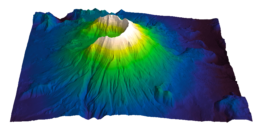
Evan Bianco of Agile Geoscience wrote a wonderful post on how to use python to import, manipulate, and display digital elevation data for Mt St Helens before and after the infamous 1980 eruption. He also calculated the difference between the two surfaces to calculate the volume that was lost because of the eruption to further showcase Python’s capabilities. I encourage readers to go through the extended version of the exercise by downloading his iPython Notebook and the two data files here and here.
I particularly like Evan’s final visualization (consisting of stacked before eruption, difference, and after eruption surfaces) which he created in Mayavi, a 3D data visualization module for Python. So much so that I am going to piggy back on his work, and show how to import a custom palette in Mayavi, and use it to color one of the surfaces.
Python Code
This first code block imports the linear Lightness palette. Please refer to my last post for instructions on where to download the file from.
import numpy as np
# load 256 RGB triplets in 0-1 range:
LinL = np.loadtxt('Linear_L_0-1.txt')
# create r, g, and b 1D arrays:
r=LinL[:,0]
g=LinL[:,1]
b=LinL[:,2]
# create R,G,B, and ALPHA 256*4 array in 0-255 range:
r255=np.array([floor(255*x) for x in r],dtype=np.int)
g255=np.array([floor(255*x) for x in g],dtype=np.int)
b255=np.array([floor(255*x) for x in b],dtype=np.int)
a255=np.ones((256), dtype=np.int); a255 *= 255;
RGBA255=zip(r255,g255,b255,a255)
This code block imports the palette into Mayavi and uses it to color the Mt St Helens after the eruption surface. You will need to have run part of Evan’s code to get the data.
from mayavi import mlab
# create a figure with white background
mlab.figure(bgcolor=(1, 1, 1))
# create surface and passes it to variable surf
surf=mlab.surf(after, warp_scale=0.2)
# import palette
surf.module_manager.scalar_lut_manager.lut.table = RGBA255
# push updates to the figure
mlab.draw()
mlab.show()
You can use the code snippets in here or download the iPython notebook from here (*** please see update ***). You will need NumPy in addition to Matplotlib.
*** UPDATE ***
Fellow Pythonista Matt Hall of Agile Geoscience extended this work – see comment below to include more flexible import of the data and formatting routines, and code to reverse the colormap. Please use Matt’s expanded iPython notebook.
Preliminaries
First of all, get the color palettes in plain ASCII format rom this page. Download the .odt file for the RGB range 0-1 colors, change the file extension to .zip, and unzip it. Next, open the file Linear_L_0-1, which contains comma separated values, replace commas with tabs, and save as .txt file. That’s it, the rest is in Python.
Code snippets – importing data
Let’s bring in numpy and matplotlib:
%pylab inline
import numpy as np
%matplotlib inline
import matplotlib.pyplot as plt
Now we load the data. We get RGB triplets from tabs delimited text file. Values are expected in the 0-1 range, not 0-255 range.
which is the format required to make the colormap using matplotlib.colors. Here’s the code:
b3=LinL[:,2] # value of blue at sample n
b2=LinL[:,2] # value of blue at sample n
b1=linspace(0,1,len(b2)) # position of sample n - ranges from 0 to 1

# setting up columns for list
g3=LinL[:,1]
g2=LinL[:,1]
g1=linspace(0,1,len(g2))

r3=LinL[:,0]
r2=LinL[:,0]
r1=linspace(0,1,len(r2))

# creating list
R=zip(r1,r2,r3)
G=zip(g1,g2,g3)
B=zip(b1,b2,b3)

# transposing list
RGB=zip(R,G,B)
rgb=zip(*RGB)
# print rgb

# creating dictionary
k=['red', 'green', 'blue']
LinearL=dict(zip(k,rgb)) # makes a dictionary from 2 lists
which gives you this result: Notice that if the original file hadn’t had 256 samples, and you wanted a 256 sample color palette, you’d use the line below instead: