Spectral lightness rainbow colormap

Spectral lightness rainbow

Quick post to share my replica of Ethan Montag ‘s Spectral lightness colormap from this paper. My version has a linear Lightness profile (Figure 1) that increases monotonically from 0 (black) to 100 (white) while Hue cycles from 180 to 360 degrees and then wraps around and continues from 0 to 270.

You can download the colormap files (comma separated in MS Word .doc format) with RGB values in 0-1 range and 0-255 range.

L-plot

Figure 1

Spectral-L

Figure 2

Matlab code

To run this code you will need Colorspace, a free function from Matlab File Exchange, for the color space transformations.

%% generate Chroma, Lightness, Hue components
h2=linspace(0,270,60*2.56);
h1=linspace(180,360,103);
h=horzcat(h1,h2);
c=ones(1,256)*25;
l=linspace(0,100,256);
%% merge together
lch = vertcat(l,c,h)';
%% convert to RGB
rgb = colorspace('LCH->rgb',lch);
%% Plot color-coded lightness profile
figure;
h=colormapline(1:1:256,lch(:,1),[],rgb);
set(h,'linewidth',2.8);
title('Montag Spectral L* lightness plot ','Color','k','FontSize',12,'FontWeight','demi');
%%  Pyramid test data
PY=zeros(241,241);
for i = 1:241
    temp=(0:1:i-1);
      PY(i,1:i)=temp(:);
end
test=PY.';
test=test-1;
test(test==-1)=0;
test1=test([2:1:end,1],:);
PY1=PY+test1;
PY2=fliplr(PY1);
PY3= flipud(PY1);
PY4=fliplr(PY3);
GIZA=[PY1,PY2;PY3,PY4].*2;
x=linspace(1,756,size(GIZA,1));
y=x;
[X,Y]=meshgrid(x,y);
clear i test test1 PY PY1 PY2 PY3 PY4 temp;

%% display Pyramid surface
fig1=figure;
surf(X,Y,GIZA,GIZA,'FaceColor','interp','EdgeColor','none');
view(-35,70);
colormap(rgb);
axis off;
grid off;
colorbar;
% set(fig1,'Position',[720 400 950 708]);
% set(fig1,'OuterPosition',[716 396 958 790]);
title('Montag Spectral L*','Color','k','FontSize',12,'FontWeight','demi');

Aknowledgements

The coloured lightness profiles were made using the Colormapline submission from the Matlab File Exchange.

Visualizing colormap artifacts

In Evaluate and compare colormaps, I have shown how to extract and display the lightness profile of a colormap using Python. I do this routinely with colormaps, but I realize it takes an effort, and not all users may feel comfortable using code to test whether a colormap is perceptual or not.

This got me thinking that there is perhaps a need for a user-friendly, interactive tool to help identify colormap artifacts, and wondering how it would look like.

In a previous post, Comparing color palettes, I plotted the elevation for the South American continent from the Global Land One-km Base Elevation Project using four different color palettes. In Figure 1 below I plot again 3 of those: rainbow, linear lightness rainbow, and grayscale, respectively, from left to right. In maps like these some artifacts are very evident. For example there’s a classic film negative effect in the map on the left, where the Guiana Highlands and the Brazilian Highlands, both in blue, seem to stand lower than the Amazon basin, in violet. This is due to the much lower lightness (or alternatively intensity) of the colour blue compared to the violet.

South_America_maps_post

Figure 1


However, other artifacts are more subtle, like the inversion of the highest peaks in the Andes, which are coloured in red, relative to their surroundings, in particular the Altipiano, an endorheic basin that includes Lake Titicaca.

My idea for this tool is simple, and consists of two windows. The first is a basemap window which can display either a demo dataset or user data loaded from an ASCII grid file. In this window the user would interactively select a profile by building a polyline with point-and-click, like the one in Figure 2 in white.

South_America_map_window

Figure 2

The second window would show the elevation profile with the colour fill assigned based on the colormap, like in Figure 3 at the bottom (with colormap to the right), and with a profile of the corresponding colour intensities (on a scale 1-255) at the top.

In this view it is immediately evident that, for example, the two highest peaks near the center, coloured in red, are relative intensity lows. Another anomaly is the absolute intensity low on the right side, corresponding to the colour blue, where the elevation profile varies smoothly.

Figure 3

Figure 3

I created this concept prototype using a combination of Matlab, Python, and Surfer. I welcome suggestions for possible additional features, and would like to hear form folks interested in collaboration on a web app (ideally in Python).

What your brain does with colours when you are not “looking” – part 2

In What your brain does with colours when you are not “looking”, part 1, I displayed some audio spectrogram data (courtesy of Giuliano Bernardi at the University of Leuven) using 5 different colormaps to render the amplitude values: Jet (until recently Matlab’s standard colormap), grayscale, linear lightness rainbow, modified heated body, and cube lightness rainbow. I then asked readers to cast a vote for what they thought was the best colormap to visualize this dataset.

I was curious to see how all these colormaps fared, but my expectation was that Jet would sink to the bottom.  I was really surprised to see it came on top, one vote ahead of the linear lightness rainbow (21 and 20 votes out of 62, respectively). The modified heated body followed with 11 votes.

My surprise comes from the fact that Jet carries perceptual artifacts within the progression of colours (see for example this post). One way to demonstrate these artifacts is to convert the 2D map into a 3D surface where again we use Jet to colour amplitude values, but we use the intensities from the 2D map for the elevation. This can be done for example using the Interactive 3D Surface Plot plugin for ImageJ (as in my previous post ). The resulting surface is shown in Figure 1. This is almost exactly what your brain would do when you look at the 2D map colored with Jet in the previous post.

Surface_Plot_of_spectrogram_jet

Figure 1

In Figure 2 the same data is now displayed as a surface where amplitude values were used for the elevation, with a very light sun shading to help a bit with the perception of relief, but no colormap at all. to When comparing Figure 1 with Figure 2 one of the artifacts is immediately recognized: the highest values in Figure 2, which honours the data, become a relative low in Figure 1. This is because red has lower intensity than yellow and therefore data colored in red in 2D are plotted at a lower elevation than data colored in yellow, even though the amplitudes of the latter were lowest.

spectrogram_surf

Figure 2

For these reasons, I did not expect Jet to be the top pick. On the other hand, I think Jet is perhaps favoured because with consistent use, our brain, learns in part to accommodate for these non-perceptual artifacts in 2D maps, and because it has at least two regions of higher contrast (higher magnitude gradient) than other colormaps. Unfortunately, as I wrote in a recently published tutorial, these regions are randomly placed in the colormap, and the gradients are variable, so we gain on contrast but lose on faithfulness in representing the data structure.

Matt Hall wrote a great comment following the previous post, really making an argument for switching between multiple colormaps in the interpretation stage to explore  and highlight features in both the signal and the noise in the data, and that perhaps no single colormap is best overall. I agree 100% on almost everything Matt said, except perhaps on the best overall: looking at the 2D maps, at least with this dataset, I feel the heated body could be the best overall colormap, even if marginally. In Figure 3, Figure 4, Figure 5, and Figure 6 I show the 3D displays obtained by converting the 2D grayscale, linear lightness rainbow, modified heated body, and cube llightness rainbow, respectively. Looking at the 3D displays altogether gives me a confirmation of that feeling.

What do you think?

Surface_Plot_of_spectrogram_gray

Figure 3

Surface_Plot_of_spectrogram_lin_L_rainbow

Figure 4

Surface_Plot_of_spectrogram_mod_heated_body

Figure 5

Surface_Plot_of_spectrogram_CubicYF

Figure 6

New Matlab isoluminant colormap for azimuth data

I recently added to my Matlab File Exchange function, Perceptually improved colormaps, a colormap for periodic data like azimuth or phase. I am going to briefly showcase it using data from my degree thesis in geology, which I used before, for example in Visualization tips for geoscientists – Matlab. Figure 1, from that post, shows residual gravity anomalies in milligals.

data cube1_final_shading_slope

Figure 1

Often we’re interested in characterizing these anomalies by calculating the direction of maximum dip at each point on the surface, and for that direction display the azimuth, or dip azimuth.  I’ve done this for the surface of residual anomalies from Figure 1 and displayed the azimuth in Figure 2. Azimuth from 0 to 360 degrees are color-coded using Jet, Matlab’s standard colormap (until recently). Typically I do not trust azimuth values when the dip is close to zero because it is often contaminated by noise so I would use shading to de-saturate the colors where dip has the lowest values, but for ease of discussion I haven’t done so in this case.

Figure 2. Azimuth values color-coded with Jet.

Figure 2. Azimuth values color-coded with Jet.

There are two problems with Figure 2. First, the well-known problems with the jet colormap. For example, blue is too dark and blue areas appear as bands of constant colour. Yellow is much lighter than any other colour so we see artificial yellow edges that are not really present in the data. But there is an additional issue in Figure 2 because azimuths close in value to 0 and 360 degrees are colored with blue and red, respectively, instead of a single color as they should, causing an additional artificial edge.

In Figure 3 I recolored the map using a colormap that replicates those used in many geophysical software tools to display azimuth or phase data. This is better because it wraps around at 360 degrees but the perceptual issues are unresolved: in this case red, yellow and blue all appear as sharp perceptual edges.

standardAZ

Figure 3. Azimuth values color-coded with generic azimuth colormap.


isoAZ

Figure 4. Azimuth values color-coded with isoluminant azimuth colormap.


In Figure 4 I used my new colormap, called isoAZ (for isoluminant azimuth). This colormap is much better because not only does it wraps around at 360 degrees, but also lightness is held constant for all colors, which eliminates the perceptual anomalies. All the artificial yellow, red, and blue edges are gone, only real edges are left. This can be more easily appreciated in the figure below: if you hover with your mouse over it you are able to switch back and forth between Figure 3 and Figure 4.

isoAZstandardAZ

From an interpretation point of view, azimuths 180 degrees apart are of opposing colours, which is ideal for dip azimuth data because it allows us to easily recognize folds where dips of opposite direction are juxtaposed at an edge. One example is the sharp edge in the northwest quadrant of Figure 4, where magenta is juxtaposed to green. If you look at Figure 1 you see that there’s a relative high in this area (the edge in Figure 4) with dips of opposite direction on either side (East and West, or 0 and 360 degrees).

The colormap was created in the Lightness-Chroma-Hue color space, a polar transform of the Lab color space, where lightness is the vertical axis and at each value of lightness, chroma is the radial coordinate and hue the polar angle. One limitation of this approach is that due to theirregular  shape of the color gamut section at each lightness value, we can never exceed  chroma values  of about 38-40 (at lightness = 65 in Matlab; in Python, with extensive trial and error, I have not been able to go past 36 using the Scikit-image Color module), which make the resulting colors pale, pastely.

it creates For those that want to experiment with it further, I used just a few lines of code similar to the ones below:

radius = 38; % chroma
theta = linspace(0, 2*pi, 256)'; % hue
a = radius * cos(theta);
b = radius * sin(theta);
L = (ones(1, 256)*65)'; % lightness
Lab = [L, a, b];
RGB=colorspace('RGB<-Lab',Lab(end:-1:1,:));

This code is a modification from an example by Steve Eddins on a post on his Matlab Central blog. In Steve’s example the colormap cycles through the hues as lightness increases monotonically (which by the way is an excellent way to generate a perceptual rainbow). In this case lightness is kept constant and hue cycles through the entire 360 degrees and wraps around. Also, instead of using the Image Processing Toolbox, I used  Colorspace, a free function from Matlab File Exchange, for the color space transformations.

For data like fracture orientation where azimuths 180 degrees apart are equivalent it is better to stack two of these isoluminant colormaps in a row. In this way we place opposing colors 90 degrees apart, whereas color 180 degrees apart are the same. You can do it using Matlab commands repmat or vertcat, as below:

radius = 38; % chroma
theta = linspace(0, 2*pi, 128)'; % hue
a = radius * cos(theta);
b = radius * sin(theta);
L = (ones(1, 128)*65)'; % lightness
Lab = [L, a, b];
rgb=colorspace('RGB<-Lab',Lab(end:-1:1,:));
RGB=vertcat(rgb,rgb);

Parula: a new Matlab colormap

Steve Eddins of the Matwork just published a post announcing a new Matlab colormap to replace Jet. It is called Parula (more to come on his blog about this intriguing name).

parula

First impression: Parula looks good.

And while I haven’t had time to take it into Python to run a full perceptual test and into ImageJ for a colour blindness test, as a preliminary test I did convert it to grayscale with an online picture converting tool that uses the lightness information to perform the conversion (instad of just desaturating the colors) and the result shows monotonic changes in gray.

parula_compare

Looks promising… Full test to come.

What your brain does with colours when you are not “looking” – part 1

When I published the last post of my series The rainbow is dead…long live the rainbow! there was a great discussion in the comments section with Giuliano Bernardi, a Ph.D. student at the University of Leuven, on the use of different colour palettes in audio spectrogram visualization.

Since then Giuliano has been kind enough to provide me with the data for one of his spectrograms, so I am resuming the discussion. Below here is a set of 5 figures generated in Matlab from the same data using different colormaps. With this post I’d like to get readers involved and ask to cast your vote for the colormap you prefer, and even drop a line in the comments section to tell us the reason for your preference.

In the second post I’ll show the data displayed with the same 5 colormaps but using a different type of visualization, which will reveal what our brain is doing with the colours (without our full knowledge and consent), and then I will ask again to vote for your favourite.


spectrogram_jet

A – Jet colormap

spectrogram_gray

B – Gray scale

spectrogram_lin_L_rainbow

C – Linear Lightness rainbow

spectrogram_mod_heated_body

D – Modified heated body (linear Lightness)

spectrogram_CubicYF

E – Cube-law Lightness rainbow

Visualize Mt St Helen with Python and a custom color palette

Evan Bianco of Agile Geoscience wrote a wonderful post on how to use python to import, manipulate, and display digital elevation data for Mt St Helens before and after the infamous 1980 eruption. He also calculated the difference between the two surfaces to calculate the volume that was lost because of the eruption to further showcase Python’s capabilities. I encourage readers to go through the extended version of the exercise by downloading his iPython Notebook and the two data files here and here.

I particularly like Evan’s final visualization (consisting of stacked before eruption, difference, and after eruption surfaces) which he created in Mayavi, a 3D data visualization module for Python. So much so that I am going to piggy back on his work, and show how to import a custom palette in Mayavi, and use it to color one of the surfaces.

Python Code

This first code block imports the linear Lightness palette. Please refer to my last post for instructions on where to download the file from.

import numpy as np
# load 256 RGB triplets in 0-1 range:
LinL = np.loadtxt('Linear_L_0-1.txt') 
# create r, g, and b 1D arrays:
r=LinL[:,0] 
g=LinL[:,1]
b=LinL[:,2]
# create R,G,B, and ALPHA 256*4 array in 0-255 range:
r255=np.array([floor(255*x) for x in r],dtype=np.int) 
g255=np.array([floor(255*x) for x in g],dtype=np.int)
b255=np.array([floor(255*x) for x in b],dtype=np.int)
a255=np.ones((256), dtype=np.int); a255 *= 255;
RGBA255=zip(r255,g255,b255,a255)

This code block imports the palette into Mayavi and uses it to color the Mt St Helens after the eruption surface. You will need to have run part of Evan’s code to get the data.

from mayavi import mlab
# create a figure with white background
mlab.figure(bgcolor=(1, 1, 1))
# create surface and passes it to variable surf
surf=mlab.surf(after, warp_scale=0.2)
# import palette
surf.module_manager.scalar_lut_manager.lut.table = RGBA255
# push updates to the figure
mlab.draw()
mlab.show()

After_Linear_L

Reference

Mayavi custom colormap example


Related Posts (MyCarta)

The rainbow is dead…long live the rainbow! – Part 5 – CIE Lab linear L* rainbow

Convert color palettes to Python Matplotlib colormaps

Related Posts (external)

How much rock was erupted from Mt St Helens

Convert color palettes to python matplotlib colormaps

This is a quick post to show you how to import my perceptual color palettes – or any other color palette – into Python and convert them into Matplotlib colormaps. We will use as an example the CIE Lab linear L* palette, which was my adaptation to Matlab of the luminance controlled colormap by Kindlmann et al.

Introduction

You can use the code snippets in here or download the iPython notebook from here (*** please see update ***). You will need NumPy in addition to Matplotlib.

***  UPDATE  ***

Fellow Pythonista Matt Hall of Agile Geoscience extended this work – see comment below to include more flexible import of the data and formatting routines, and code to reverse the colormap. Please use Matt’s expanded iPython notebook.

Preliminaries

First of all, get the color palettes in plain ASCII format rom this page. Download the .odt file for the RGB range 0-1 colors, change the file extension to .zip, and unzip it. Next, open the file Linear_L_0-1, which contains comma separated values, replace commas with tabs, and save as .txt file. That’s it, the rest is in Python.

Code snippets – importing data

Let’s bring in numpy and matplotlib:

%pylab inline
import numpy as np
%matplotlib inline
import matplotlib.pyplot as plt

Now we load the data. We get RGB triplets from tabs delimited text file. Values are expected in the 0-1 range, not 0-255 range.

LinL = np.loadtxt('Linear_L_0-1.txt')

A quick QC of the data:

LinL[:3]

gives us:

array
([[ 0.0143,  0.0143,  0.0143],
  [ 0.0404,  0.0125,  0.0325],
  [ 0.0516,  0.0154,  0.0443]])

looking good!

Code snippets – creating colormap

Now we want to go from an array of values for blue in this format:

b1=[0.0000,0.1670,0.3330,0.5000,0.6670,0.8330,1.0000]

to a list that has this format:

[(0.0000,1.0000,1.0000),
(0.1670,1.0000,1.0000),
(0.3330,1.0000,1.0000),
(0.5000,0.0000,0.0000),
(0.6670,0.0000,0.0000),
(0.8330,0.0000,0.0000),
(1.0000,0.0000,0.0000)]

# to a dictionary entry that has this format:

{
'blue': [
(0.0000,1.0000,1.0000),
(0.1670,1.0000,1.0000),
(0.3330,1.0000,1.0000),
(0.5000,0.0000,0.0000),
(0.6670,0.0000,0.0000),
(0.8330,0.0000,0.0000),
(1.0000,0.0000,0.0000)],
...
...
}

which is the format required to make the colormap using matplotlib.colors. Here’s the code:

b3=LinL[:,2] # value of blue at sample n
b2=LinL[:,2] # value of blue at sample n
b1=linspace(0,1,len(b2)) # position of sample n - ranges from 0 to 1

# setting up columns for list
g3=LinL[:,1]
g2=LinL[:,1]
g1=linspace(0,1,len(g2))

r3=LinL[:,0]
r2=LinL[:,0]
r1=linspace(0,1,len(r2))

# creating list
R=zip(r1,r2,r3)
G=zip(g1,g2,g3)
B=zip(b1,b2,b3)

# transposing list
RGB=zip(R,G,B)
rgb=zip(*RGB)
# print rgb

# creating dictionary
k=['red', 'green', 'blue']
LinearL=dict(zip(k,rgb)) # makes a dictionary from 2 lists

Code snippets – testing colormap

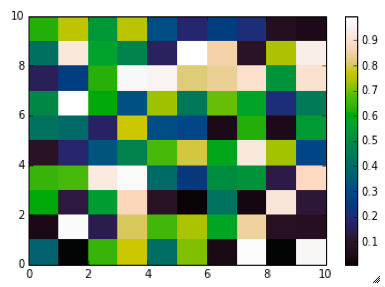
That’s it, with the next 3 lines we are done:

my_cmap = matplotlib.colors.LinearSegmentedColormap('my_colormap',LinearL)
pcolor(rand(10,10),cmap=my_cmap)
colorbar()

which gives you this result: LinearL test Notice that if the original file hadn’t had 256 samples, and you wanted a 256 sample color palette, you’d use the line below instead:

my_cmap = matplotlib.colors.LinearSegmentedColormap('my_colormap',LinearL,256)

Have fun!

Related Posts (MyCarta)

The rainbow is dead…long live the rainbow! – Part 5 – CIE Lab linear L* rainbow

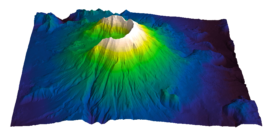
Visualize Mt S Helens with Python and a custom color palette

A bunch of links on colors in Python

http://bl.ocks.org/mbostock/5577023

http://matplotlib.org/api/cm_api.html

http://matplotlib.org/api/colors_api.html

http://matplotlib.org/examples/color/colormaps_reference.html

http://matplotlib.org/api/colors_api.html#matplotlib.colors.ListedColormap

http://wiki.scipy.org/Cookbook/Matplotlib/Show_colormaps

http://stackoverflow.com/questions/21094288/convert-list-of-rgb-codes-to-matplotlib-colormap

http://stackoverflow.com/questions/16834861/create-own-colormap-using-matplotlib-and-plot-color-scale

http://stackoverflow.com/questions/11647261/create-a-colormap-with-white-centered-around-zero