Busting bad colormaps with Python and Panel

I have not done much work with, or written here on the blog about colormaps and perception in quite some time.

Last spring, however, I decided to build a web-based app to show the effects of using a bad colormaps. This stemmed from two needs: first, to further my understanding of Panel, after working through the awesome tutorial by James Bednar, Panel: Dashboards (at PyData Austin 2019); and second, to enable people to explore interactively the effects of bad colormaps on their perception, and consequently the ability to on interpret faults on a 3D seismic horizon.

I introduced the app at the Transform 2020 virtual subsurface conference, organized by Software Underground last June. Please watch the recording of my lightning talk as it explains in detail the machinery behind it.

I am writing this post in part to discuss some changes to the app. Here’s how it looks right now:

The most notable change is the switch from one drop-down selector to two-drop-down selectors, in order to support both the Matplotlib collection and the Colorcet collection of colormaps. Additionally, the app has since been featured in the resource list on the Awesome Panel site, an achievement I am really proud of.

awesome_panel

You can try the app yourself by either running the notebook interactively with Binder, by clicking on the button below:
Binder

or, by copying and pasting this address into your browser:

https://mybinder.org/v2/gh/mycarta/Colormap-distorsions-Panel-app/master?urlpath=%2Fpanel%2FDemonstrate_colormap_distortions_interactive_Panel

Let’s look at a couple of examples of insights I gained from using the app. For those that jumped straight to this example, the top row shows:

  • the horizon, plotted using the benchmark grayscale colormap, on the left
  • the horizon intensity, derived using skimage.color.rgb2gray, in the middle
  • the Sobel edges detected on the intensity, on the right

and the bottom row,  shows:

  • the horizon, plotted using the Matplotlib gist_rainbow colormap, on the left
  • the intensity of the colormapped, in the middle. This is possible thanks to a function that makes a figure (but does not display it), plots the horizon with the specified colormap, then saves plot in the canvas to an RGB numpy array
  • the Sobel edges detected on the colormapped intensity, on the right

I think the effects of this colormaps are already apparent when comparing the bottom left plot to the top left plot. However, simulating perception can be quite revealing for those that have not considered these effects before. The intensity in the bottom middle plot is very washed out in the areas corresponding to green color in the bottom left, and as a result, many of the faults are not visible any more, or only with much difficulty, which is demonstrated by the Sobel edges in the bottom right.

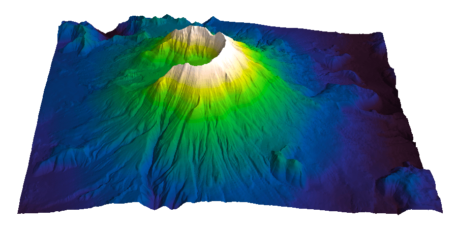
And if you are not quite convinced yet, I have created these hill-shaded maps, using Matt Hall”s delightful function from this notebook (and check his blog post):

Below is another example, using the Colocrcet cet_rainbow which is is one of Peter Kovesi’s perceptually uniform colormaps.  I use many of Peter’s colormaps, but never used this one, because I use my own perceptual rainbow, which does not have  a fully saturated yellow, or a fully saturated red. I think the app demonstrate, that even though they are more subtle , this rainbow still is introducing some artifacts. The yellow colour creates narrow flat bands, visible in the intensity and Sobel plots, and indicated by yellow arrows; the red colour is also bad as usual, causing an artificial decrease in intensity(magenta arrows).

Upcoming book: 52 things you should know about Geocomputing

I am very excited to write that, after a successful second attempt at collecting enough essays, the book 52 Things You Should Know About Geocomputing, by Agile Libre, is very likely to become a reality.

*** July 2020 UPDATE ***

This project got a much needed boost during the hackathon at the 2020 Transform virtual event. Watch the video recording on the group YouTube channel here.

*********************

In one of the three chapter I submitted for this book, Prototype colourmaps for fault interpretation, I talk about building a widget for interactive generation of grayscale colourmaps with sigmoid lightness. The whole process is well described in the chapter and showcased in the accompanying GitHub repo.

This post is an opportunity for me to reflect on how revisiting old projects is very important. Indeed, I consider it an essential part of how I approach scientific computing, and a practical way to incorporate new insights, and changes (hopefully betterments) in your coding abilities.

In the fist version of the Jupyter notebook, submitted in 2017, all the calculations and all the plotting commands where packed inside a single monster function that was passed to ipywidgets.interact. Quite frankly, as time passed this approach seemed less and less Phytonic (aka mature) and no longer representative of my programming skills and style, and increased understanding of widget objects.

After a significant hiatus (2 years) I restructured the whole project in several ways:
– Converted Python 2 code to Python 3
– Created separate helper functions for each calculation and moved them to the top to improve on both clarity and reusability of the code.
– Improved and standardized function docstrings
– Optimized and reduced the number of parameters
– Switched from interact to interactive to enable access to the colormaparray in later cells (for printing, further plotting, and exporting).

The new notebook is here.

In a different chapter in the book I talk at more length about the need to Keep on improving your geocomputing projects.

.

Visualize Mt St Helen with Python and a custom color palette

Evan Bianco of Agile Geoscience wrote a wonderful post on how to use python to import, manipulate, and display digital elevation data for Mt St Helens before and after the infamous 1980 eruption. He also calculated the difference between the two surfaces to calculate the volume that was lost because of the eruption to further showcase Python’s capabilities. I encourage readers to go through the extended version of the exercise by downloading his iPython Notebook and the two data files here and here.

I particularly like Evan’s final visualization (consisting of stacked before eruption, difference, and after eruption surfaces) which he created in Mayavi, a 3D data visualization module for Python. So much so that I am going to piggy back on his work, and show how to import a custom palette in Mayavi, and use it to color one of the surfaces.

Python Code

This first code block imports the linear Lightness palette. Please refer to my last post for instructions on where to download the file from.

import numpy as np
# load 256 RGB triplets in 0-1 range:
LinL = np.loadtxt('Linear_L_0-1.txt') 
# create r, g, and b 1D arrays:
r=LinL[:,0] 
g=LinL[:,1]
b=LinL[:,2]
# create R,G,B, and ALPHA 256*4 array in 0-255 range:
r255=np.array([floor(255*x) for x in r],dtype=np.int) 
g255=np.array([floor(255*x) for x in g],dtype=np.int)
b255=np.array([floor(255*x) for x in b],dtype=np.int)
a255=np.ones((256), dtype=np.int); a255 *= 255;
RGBA255=zip(r255,g255,b255,a255)

This code block imports the palette into Mayavi and uses it to color the Mt St Helens after the eruption surface. You will need to have run part of Evan’s code to get the data.

from mayavi import mlab
# create a figure with white background
mlab.figure(bgcolor=(1, 1, 1))
# create surface and passes it to variable surf
surf=mlab.surf(after, warp_scale=0.2)
# import palette
surf.module_manager.scalar_lut_manager.lut.table = RGBA255
# push updates to the figure
mlab.draw()
mlab.show()

After_Linear_L

Reference

Mayavi custom colormap example


Related Posts (MyCarta)

The rainbow is dead…long live the rainbow! – Part 5 – CIE Lab linear L* rainbow

Convert color palettes to Python Matplotlib colormaps

Related Posts (external)

How much rock was erupted from Mt St Helens

Convert color palettes to python matplotlib colormaps

This is a quick post to show you how to import my perceptual color palettes – or any other color palette – into Python and convert them into Matplotlib colormaps. We will use as an example the CIE Lab linear L* palette, which was my adaptation to Matlab of the luminance controlled colormap by Kindlmann et al.

Introduction

You can use the code snippets in here or download the iPython notebook from here (*** please see update ***). You will need NumPy in addition to Matplotlib.

***  UPDATE  ***

Fellow Pythonista Matt Hall of Agile Geoscience extended this work – see comment below to include more flexible import of the data and formatting routines, and code to reverse the colormap. Please use Matt’s expanded iPython notebook.

Preliminaries

First of all, get the color palettes in plain ASCII format rom this page. Download the .odt file for the RGB range 0-1 colors, change the file extension to .zip, and unzip it. Next, open the file Linear_L_0-1, which contains comma separated values, replace commas with tabs, and save as .txt file. That’s it, the rest is in Python.

Code snippets – importing data

Let’s bring in numpy and matplotlib:

%pylab inline
import numpy as np
%matplotlib inline
import matplotlib.pyplot as plt

Now we load the data. We get RGB triplets from tabs delimited text file. Values are expected in the 0-1 range, not 0-255 range.

LinL = np.loadtxt('Linear_L_0-1.txt')

A quick QC of the data:

LinL[:3]

gives us:

array
([[ 0.0143,  0.0143,  0.0143],
  [ 0.0404,  0.0125,  0.0325],
  [ 0.0516,  0.0154,  0.0443]])

looking good!

Code snippets – creating colormap

Now we want to go from an array of values for blue in this format:

b1=[0.0000,0.1670,0.3330,0.5000,0.6670,0.8330,1.0000]

to a list that has this format:

[(0.0000,1.0000,1.0000),
(0.1670,1.0000,1.0000),
(0.3330,1.0000,1.0000),
(0.5000,0.0000,0.0000),
(0.6670,0.0000,0.0000),
(0.8330,0.0000,0.0000),
(1.0000,0.0000,0.0000)]

# to a dictionary entry that has this format:

{
'blue': [
(0.0000,1.0000,1.0000),
(0.1670,1.0000,1.0000),
(0.3330,1.0000,1.0000),
(0.5000,0.0000,0.0000),
(0.6670,0.0000,0.0000),
(0.8330,0.0000,0.0000),
(1.0000,0.0000,0.0000)],
...
...
}

which is the format required to make the colormap using matplotlib.colors. Here’s the code:

b3=LinL[:,2] # value of blue at sample n
b2=LinL[:,2] # value of blue at sample n
b1=linspace(0,1,len(b2)) # position of sample n - ranges from 0 to 1

# setting up columns for list
g3=LinL[:,1]
g2=LinL[:,1]
g1=linspace(0,1,len(g2))

r3=LinL[:,0]
r2=LinL[:,0]
r1=linspace(0,1,len(r2))

# creating list
R=zip(r1,r2,r3)
G=zip(g1,g2,g3)
B=zip(b1,b2,b3)

# transposing list
RGB=zip(R,G,B)
rgb=zip(*RGB)
# print rgb

# creating dictionary
k=['red', 'green', 'blue']
LinearL=dict(zip(k,rgb)) # makes a dictionary from 2 lists

Code snippets – testing colormap

That’s it, with the next 3 lines we are done:

my_cmap = matplotlib.colors.LinearSegmentedColormap('my_colormap',LinearL)
pcolor(rand(10,10),cmap=my_cmap)
colorbar()

which gives you this result: LinearL test Notice that if the original file hadn’t had 256 samples, and you wanted a 256 sample color palette, you’d use the line below instead:

my_cmap = matplotlib.colors.LinearSegmentedColormap('my_colormap',LinearL,256)

Have fun!

Related Posts (MyCarta)

The rainbow is dead…long live the rainbow! – Part 5 – CIE Lab linear L* rainbow

Visualize Mt S Helens with Python and a custom color palette

A bunch of links on colors in Python

http://bl.ocks.org/mbostock/5577023

http://matplotlib.org/api/cm_api.html

http://matplotlib.org/api/colors_api.html

http://matplotlib.org/examples/color/colormaps_reference.html

http://matplotlib.org/api/colors_api.html#matplotlib.colors.ListedColormap

http://wiki.scipy.org/Cookbook/Matplotlib/Show_colormaps

http://stackoverflow.com/questions/21094288/convert-list-of-rgb-codes-to-matplotlib-colormap

http://stackoverflow.com/questions/16834861/create-own-colormap-using-matplotlib-and-plot-color-scale

http://stackoverflow.com/questions/11647261/create-a-colormap-with-white-centered-around-zero