Some great examples
After my previous post in this series there was a great discussion on perceptual color palettes with some members of the Worldwide Geophysicists group on LinkedIn. Ian MacLeod shared some really good examples, and uploaded it in here.
HSL linear L rainbow palette
Today I’d like to share a color palette that I really like:

It is one of the palettes introduced in a paper by Kindlmann et al. [1]. The authors created their palettes with a technique they call luminance controlled interpolation. They explain it in this online presentation. However they used different palettes (their isoluminant rainbow, and their heated body) so if you find it confusing I recommend you look at the paper first. Indeed, this is a good read if you are interested in colormap generation techniques; it is one of the papers that encouraged me to develop the methodology for my cube law rainbow, which I will introduce in an upcoming post.
This is how I understand their method to create the palette: they mapped six pure-hue rainbow colors (magenta, blue, cyan, green, yellow, and red) in HSL space, and adjusted the Luminance by changing the HSL Lightness value to ‘match’ that of six control points evenly spaced along the gray scale palette. After that, they interpolated linearly along the L axis between 0 and 1 using the equation presented in the paper.
CIE Lab linear L* rainbow palette
For this post I will try to create a similar palette. In fact, initially I was thinking of just replicating it, so I imported the palette as a screen capture image into Matlab, reduced it to a 256×3 RGB colormap matrix, and converted RGB values to Lab to check its linearity in lightness. Below I am showing the lightness profile, colored by value of L*, and the Great Pyramid of Giza – my usual test surface – also colored by L* (notice I changed the X axis of both L* plots from sample number to Pyramid elevation to facilitate comparison of the two figures).
Clearly, although the original palette was constructed to be perceptually linear, it is not linear following my import. Notice in particular the notch in the profile in the blue area, at approximately 100 m elevation. This artifact is also visible as a flat-looking blue band in the pyramid.


I have to confess I am not too sure why the palette has this peculiar lightness profile. I suspect this may be because their palette is by construction device dependent (see the paper) so that when I took the screen capture on my monitor I introduced the artifacts.
The only way to know for sure would be to use their software to create the palette, or alternatively write the equation from the paper into Matlab code and create a palette calibrated on my monitor, then compare it to the screen captured one. Perhaps one day I will find the time to do it but having developed my own method to create a perceptual palette my interest in this one became just practical: I wanted to get on with it and use it.
Fixing and testing the palette
Regardless of what the cause might be for this nonlinear L* profile, I decide to fix it and I did it by simply replacing the original profile with a new one, linearly changing between 0.0 and 1.0. Below I am showing the L* plot for this adjusted palette, and the Great Pyramid of Giza, both again colored by value of L*.


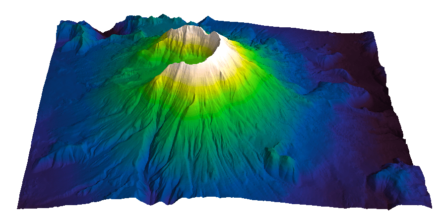
The pyramid with the adjusted palette seems better: the blue band is gone, and it looks great. I am ready to try it on a more complex surface. For that I have chosen the digital elevation data for South America available online through the Global Land One-km Base Elevation Project at the National Geophysical Data Center. To load and display the data in Matlab I used the first code snippet in Steve Eddin’s post on the US continental divide (modified for South America data tiles). Below is the data mapped using the adjusted palette. I really like the result: it’s smooth and it looks right.

But how do I know, really? I mean, once I move away from my perfectly flat pyramid surface, how do I know what to expect, or not expect? In other words, how would I know if an edge I see on the map above is an artifact, or worse, that the palette is not obscuring real edges?
In some cases the answer is simple. Let’s take a look at the four versions of the map in my last figure. The first on the left was generated using th ROYGBIV palette I described in this post. It would be obvious to me, even if I never looked at the L* profile, that the blue areas are darker than the purple areas, giving the map a sort of inverted image look.

But how about the second map from the left? For this I used the default rainbow from a popular mapping program. This does not look too bad at first sight. Yes, the yellow is perceived as a bright, sharp edge, and we now know why that is, but other than that it would be hard to tell if there are artifacts. After a second look the whole area away from the Andes is a bit too uniform.
A good way to assess these maps is to use grayscale, which we know is a good perceptual option, as a benchmark. This is the last map on the right. The third map of South America was coloured using my adjusted linear L* palette. This maps looks more similar to our grayscale benchmark. Comparison of the colorbars will also help: the third and fourth are very similar and both look perceptually linear, whereas the third does show flatness in the blue and green areas.
Let me know what you think of these examples. And as usual, you are welcome to use the palette in your work. You can download it here.
UPDATE
With my following post, Comparing color palettes, I introduced my new method to compare palettes with ImageJ and the 3D color inspector plugin. Here below are the recorded 3D animations of the initial and adjusted palettes respectively. In 3D it is easier to see there is an area of flat L* between the dark purple and dark blue in the initial color palette. The adjusted color palette instead monotonically spirals upwards.
References
[1] Kindlmann, G. Reinhard, E. and Creem, S., 2002, Face-based Luminance Matching for Perceptual Colormap Generation, IEEE – Proceedings of the conference on Visualization ’02
Related posts (MyCarta)
The rainbow is dead…long live the rainbow! – the full series
What is a colour space? reblogged from Colour Chat
Color Use Guidelines for Mapping and Visualization
A rainbow for everyone
Is Indigo really a colour of the rainbow?
Why is the hue circle circular at all?
A good divergent color palette for Matlab
Related topics (external)
Color in scientific visualization
The dangers of default disdain
Color tools
How to avoid equidistant HSV colors
Non-uniform gradient creator
Colormap tool
Color Oracle – color vision deficiency simulation – stand alone (Window, Mac and Linux)
Dichromacy – color vision deficiency simulation – open source plugin for ImageJ
Vischeck – color vision deficiency simulation – plugin for ImageJ and Photoshop (Windows and Linux)
For teachers
NASA’s teaching resources for grades 6-9: What’s the Frequency, Roy G. Biv?
ImageJ and 3D Color inspector plugin
http://rsbweb.nih.gov/ij/docs/concepts.html
http://rsb.info.nih.gov/ij/plugins/color-inspector.html


