Spectral lightness rainbow colormap

Spectral lightness rainbow

Quick post to share my replica of Ethan Montag ‘s Spectral lightness colormap from this paper. My version has a linear Lightness profile (Figure 1) that increases monotonically from 0 (black) to 100 (white) while Hue cycles from 180 to 360 degrees and then wraps around and continues from 0 to 270.

You can download the colormap files (comma separated in MS Word .doc format) with RGB values in 0-1 range and 0-255 range.

L-plot

Figure 1

Spectral-L

Figure 2

Matlab code

To run this code you will need Colorspace, a free function from Matlab File Exchange, for the color space transformations.

%% generate Chroma, Lightness, Hue components
h2=linspace(0,270,60*2.56);
h1=linspace(180,360,103);
h=horzcat(h1,h2);
c=ones(1,256)*25;
l=linspace(0,100,256);
%% merge together
lch = vertcat(l,c,h)';
%% convert to RGB
rgb = colorspace('LCH->rgb',lch);
%% Plot color-coded lightness profile
figure;
h=colormapline(1:1:256,lch(:,1),[],rgb);
set(h,'linewidth',2.8);
title('Montag Spectral L* lightness plot ','Color','k','FontSize',12,'FontWeight','demi');
%%  Pyramid test data
PY=zeros(241,241);
for i = 1:241
    temp=(0:1:i-1);
      PY(i,1:i)=temp(:);
end
test=PY.';
test=test-1;
test(test==-1)=0;
test1=test([2:1:end,1],:);
PY1=PY+test1;
PY2=fliplr(PY1);
PY3= flipud(PY1);
PY4=fliplr(PY3);
GIZA=[PY1,PY2;PY3,PY4].*2;
x=linspace(1,756,size(GIZA,1));
y=x;
[X,Y]=meshgrid(x,y);
clear i test test1 PY PY1 PY2 PY3 PY4 temp;

%% display Pyramid surface
fig1=figure;
surf(X,Y,GIZA,GIZA,'FaceColor','interp','EdgeColor','none');
view(-35,70);
colormap(rgb);
axis off;
grid off;
colorbar;
% set(fig1,'Position',[720 400 950 708]);
% set(fig1,'OuterPosition',[716 396 958 790]);
title('Montag Spectral L*','Color','k','FontSize',12,'FontWeight','demi');

Aknowledgements

The coloured lightness profiles were made using the Colormapline submission from the Matlab File Exchange.

Visualizing colormap artifacts

In Evaluate and compare colormaps, I have shown how to extract and display the lightness profile of a colormap using Python. I do this routinely with colormaps, but I realize it takes an effort, and not all users may feel comfortable using code to test whether a colormap is perceptual or not.

This got me thinking that there is perhaps a need for a user-friendly, interactive tool to help identify colormap artifacts, and wondering how it would look like.

In a previous post, Comparing color palettes, I plotted the elevation for the South American continent from the Global Land One-km Base Elevation Project using four different color palettes. In Figure 1 below I plot again 3 of those: rainbow, linear lightness rainbow, and grayscale, respectively, from left to right. In maps like these some artifacts are very evident. For example there’s a classic film negative effect in the map on the left, where the Guiana Highlands and the Brazilian Highlands, both in blue, seem to stand lower than the Amazon basin, in violet. This is due to the much lower lightness (or alternatively intensity) of the colour blue compared to the violet.

South_America_maps_post

Figure 1


However, other artifacts are more subtle, like the inversion of the highest peaks in the Andes, which are coloured in red, relative to their surroundings, in particular the Altipiano, an endorheic basin that includes Lake Titicaca.

My idea for this tool is simple, and consists of two windows. The first is a basemap window which can display either a demo dataset or user data loaded from an ASCII grid file. In this window the user would interactively select a profile by building a polyline with point-and-click, like the one in Figure 2 in white.

South_America_map_window

Figure 2

The second window would show the elevation profile with the colour fill assigned based on the colormap, like in Figure 3 at the bottom (with colormap to the right), and with a profile of the corresponding colour intensities (on a scale 1-255) at the top.

In this view it is immediately evident that, for example, the two highest peaks near the center, coloured in red, are relative intensity lows. Another anomaly is the absolute intensity low on the right side, corresponding to the colour blue, where the elevation profile varies smoothly.

Figure 3

Figure 3

I created this concept prototype using a combination of Matlab, Python, and Surfer. I welcome suggestions for possible additional features, and would like to hear form folks interested in collaboration on a web app (ideally in Python).

Visualize Mt St Helen with Python and a custom color palette

Evan Bianco of Agile Geoscience wrote a wonderful post on how to use python to import, manipulate, and display digital elevation data for Mt St Helens before and after the infamous 1980 eruption. He also calculated the difference between the two surfaces to calculate the volume that was lost because of the eruption to further showcase Python’s capabilities. I encourage readers to go through the extended version of the exercise by downloading his iPython Notebook and the two data files here and here.

I particularly like Evan’s final visualization (consisting of stacked before eruption, difference, and after eruption surfaces) which he created in Mayavi, a 3D data visualization module for Python. So much so that I am going to piggy back on his work, and show how to import a custom palette in Mayavi, and use it to color one of the surfaces.

Python Code

This first code block imports the linear Lightness palette. Please refer to my last post for instructions on where to download the file from.

import numpy as np
# load 256 RGB triplets in 0-1 range:
LinL = np.loadtxt('Linear_L_0-1.txt') 
# create r, g, and b 1D arrays:
r=LinL[:,0] 
g=LinL[:,1]
b=LinL[:,2]
# create R,G,B, and ALPHA 256*4 array in 0-255 range:
r255=np.array([floor(255*x) for x in r],dtype=np.int) 
g255=np.array([floor(255*x) for x in g],dtype=np.int)
b255=np.array([floor(255*x) for x in b],dtype=np.int)
a255=np.ones((256), dtype=np.int); a255 *= 255;
RGBA255=zip(r255,g255,b255,a255)

This code block imports the palette into Mayavi and uses it to color the Mt St Helens after the eruption surface. You will need to have run part of Evan’s code to get the data.

from mayavi import mlab
# create a figure with white background
mlab.figure(bgcolor=(1, 1, 1))
# create surface and passes it to variable surf
surf=mlab.surf(after, warp_scale=0.2)
# import palette
surf.module_manager.scalar_lut_manager.lut.table = RGBA255
# push updates to the figure
mlab.draw()
mlab.show()

After_Linear_L

Reference

Mayavi custom colormap example


Related Posts (MyCarta)

The rainbow is dead…long live the rainbow! – Part 5 – CIE Lab linear L* rainbow

Convert color palettes to Python Matplotlib colormaps

Related Posts (external)

How much rock was erupted from Mt St Helens

NASA’s Perpetual Ocean animation

A couple of months ago AGU blogger Dan Satterfield posted a great article titled The Turbulence of Van Gogh and the Labrador Shelf Current.

For getting maps and art together, I thought it could not be topped. Then today, I stumbled into NASA’s Perpetual Ocean animation: beautiful!

From the original Source: This is an animation of ocean surface currents from June 2005 to December 2007 from NASA satellites. Watch how bigger currents like the Gulf Stream in the Atlantic Ocean and the Kuroshio in the Pacific carry warm waters across thousands of miles at speeds greater than four miles per hour (six kilometers per hour); how coastal currents like the Agulhas in the Southern Hemisphere move equatorial waters toward Earth’s poles; and how thousands of other ocean currents are confined to particular regions and form slow-moving, circular pools called eddies. Credit: NASA/SVS

Related sites

More media options, including a 20 minute version at 30 fps can be found here

MIT general circulation model MITgcm

ECCO2: Phase II of MIT/JPL project Estimating the Circulation and Climate of the Ocean

Seismic terrain displays

Introduction

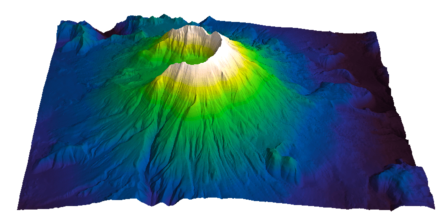
A couple of years ago I stumbled in a great 2001 paper by Beyer [1] on The Leading Edge. Being interested in visualization techniques I was drawn by the display in Figure 1 (which is a low resolution copy from Figure 2 in the paper). But what really amazed me was the suggestion that a display like this could be created in a few minutes, without doing any interpretation, by just manipulating instantaneous phase slices. With the only condition of having data of fair quality, this promised to be an awesome reconnaissance tool.

Beyer_Fig2_lowres

Figure 1 – Copyright SEG

The theory

The idea that instantaneous phase is a great attribute for interpretation has been around for a long time. There is, for example, a 1989 Exploration Geophysics paper by Duff and Mason [2]. These two authors argue that amplitude time slices are a suboptimal choice, and that instantaneous phase slices should be preferred. They give three reasons:

1) on amplitude time slices only relatively strong events remain above the bias level after gain and scaling. Weak events are submerged below the bias and remain unmappable.  Although it is the topic of a future post, it is worth mentioning I think this effect is exacerbated by the common but unfortunate choice of a divergent color palette with white in the middle. White is so bright (I call it white hole) that even more low amplitude events become indiscernible.

2) discrete boundaries corresponding to unique positions on the wavelet are displayed on instantaneous phase slices – this intra wavelet detail is lost on amplitude slices.

After-Duff-Mason 2

Figure 2 – after Duff and Mason, Figure 2

3) instantaneous time slices give DIRECTLY the sense of time dip for dipping events. In Figure 2 I show 2 parallel dipping reflectors, represented by 5 (non consecutive) traces, and 2 (non-consecutive) instantaneous phase slices (at arbitrary t1 an t2). I marked 5 discrete phase events for the top dipping reflector. The sense of time dip is given (with appropriate color palette) by the sense of color transition. Conversely, this intra wavelet detail would be lost on the amplitude time slices, with amplitudes between the black center trace and the red traces, and amplitudes between the red traces and the green traces lost within a single broad zone. The difference is probably not as dramatic nowadays with the increase in dynamic ranges available, but using instantaneous phase slices still remains advantageous for detailed mapping.

Beyer’s seismic terrain is just a natural extension of the instantaneous time slice as ( quoted from [1]):”… it then follows that the instantaneous phase (-180 deg to +180 deg) can simply be rescaled to the wavelength in ms of pseudoseismic two-way time… Seismic terrain can be thought of as a type of instantaneous wavelength generated from instantaneous phase along a time slice”. With reference to the top dipping reflector in Figure 3, the method allows generating converting the brown phase segment to the dipping blue segment (and similarly the yellow phase segment to the dipping green segment for bottom dipping event).

After-Beyer

Figure 3

The practice – Petrel

Let’s see how we can create a terrain display similar to that in Figure 1 using Petrel.

Raw data

The process starts with migrated seismic data, from which we need generate both the phase and frequency component to get us the instantaneous wavelength.

For this tutorial I use a public seismic dataset (BPA9901) available on the Norwegian Public Data Portal. In Figure 4 below I am showing an amplitude time slice (above the Chalk) from the migrated seismic volume.

time_slice

Figure 4

Step 1 – generate phase component

The first step is to generate an instantaneous phase attribute volume. This is found in the volume attributes. In Figure 5 below I am showing the instantaneous phase slice corresponding to the amplitude time slice of Figure 4.

*** N.B. *** If significant regional dips are observed in the seismic data, care should be taken in some cases  it may be beneficial (please see comment section) to remove them through flattening prior to the terrain generation.

Figure 5

Figure 5

Step 2 – generate frequency component

This is the trickiest part. In theory to get the instantaneous wavelength we would have to calculate the instantaneous frequency and divide the  instantaneous frequency attribute can be very noisy and can have spurious values in areas of low amplitude in the input data. A good practical alternative is to measure a single value of the dominant wavelet period T in an area of relatively flat reflections near the zone of interest as I am showing in Figure 6.

For the more avid readers, this is all explained quite nicely in Beyer (quoted from [1]): “Complex trace relationships dictate that the wavelength is the phase component divided by the frequency component. Thus one may be compelled to derive the seismic terrain by dividing the extracted instantaneous phase by the  extracted instantaneous frequency (carefully applying unit conversion of 1000 ms/ 360 deg or 2.78). However extracted instantaneous frequency tends to include spurious values in low amplitudes (approaching infinity according to literature and practice which correspond to poor data quality zones. Instantaneous frequency or even averaged instantaneous frequency renders the seismic terrain noisy, unrealistic, and misleading. Years of extensive use have shown that  single value of visually estimated dominant wavelet period (i.e. cycles per second) produces a very high-quality seismic terrain that closely fits the seismic events over wide areas”.

period

Figure 6

Step 3 – generate the instantaneous wavelength (seismic terrain)

Having estimated the dominant wavelet period T (in ms) , I can now use it to generate the instantaneous wavelength. We are essentially converting the data from the range [-180 180] deg to the range [-T/2 T/2] ms.

In Petrel I do it in the calculator with a formula of the type:

terrain=(((instantaneous phase +180)*T/2)/180)

The actual formula used is shown on the top row of Figure 7 below. You will notice that it isn’t exactly the same as the above formula. I added 1 to 180 to avoid division of zero values, e.g.:

(([-180 180]+180)*28/180) = ([0 180]*28/180) = ([0 5040]/180) % not good!

whereas:

(([-180 180]+181)*28/180) = ([1 181]*28/180) = ([28 5068]/180) % good!

Once the division is performed I subtract T/2 again.

Notice from Figure 7 that because we added 181 but divided by 180 there is a small adjustment to be made by hand. I get this small adjustment by double clicking on the output volume to get the statistics. In this case it is +-0.16 ms, so I run a second time the formula (bottom row, Figure 7), this time subtracting T/2 +0.16 instead of just T/2.

formula

Figure 7

Step 4 – display seismic terrain.

There are two options in Petrel to display the resulting seismic terrain volume:

Option 1 – display bump mapped terrain slices in 2D or 3D window

This is my preferred option for scanning up and down through the terrain slices. The bump mapping effect is done by double clicking on the terrain survey with a 2D or 3D window open and selected, in the Style tab>Intersection  tab. In Figure 8 I am showing the bump mapped terrain slice corresponding to the instantaneous phase time slice of Figure 5.

terrain_slice

Figure 8

Option 2 – display selected horizons of interest in 3D window

One may want to create a display such as the one in Figure 1, which for me is intended for a later stage, when integrating perhaps with extracted amplitude or attribute anomalies highlighting hydrocarbon presence.

As often in Petrel there are different ways of achieving the same result. This is how I do it. First, I create a flat surface, with a TWT value corresponding to the slice I am interested in (as in Figure 9, left panel). Then I extract and append to this surface the terrain values from that slice of interest (as in Figure 9, right panel).

Figure 9

Figure 9

Figure 10

Figure 10

Finally, in the calculations tab, I add a constant time shift corresponding to the time associated with the slice  of interest: notice the difference in Z value between the left panel in Figure 10 (before the calculation), and the right panel (after the calculation). It is also necessary to use the extracted value as visual vertical position as illustrated in Figure 11.

Figure 11

Figure 11

I am showing the result in Figure 12. This is the same terrain slice as in Figure 8.

terrain_slice extracted

Figure 12

Discussion

As a quick QC I am displaying in Figure 13 a vertical section (corresponding to the thick black line in Figure 12) from the input seismic data, with the extracted surface drawn as a thin black line.

The terrain deteriorates to the far left as we approach the edge of the survey, with fold decreasing and noise increasing, and there is a cycle skip towards the far right. But all in all I think  this is a very good result: it captures the faults well, and the whole process took less than 20 minutes with no picking.

arbitrary

Figure 13

Limitations

This method has one limitation: the maximum fault throws or stratigraphic relief (in milliseconds) that can be mapped is equal to the period T.

Acknowledgements

I wish to thank DONG Energy for agreeing to the publication of the seismic images, which were generated using company licensed Petrel.

** UPDATE **

A few readers asked clarifications on what the benefits and potential uses are of using this attribute. The short answer is that this is in fact a pseudo-horizon that tracks dipping  seismic events accurately within the range of the period of the dominant frequency period (as seen in Figure 13), which makes it an excellent reconnaissance tool.  A good quality first pass map can be made in minutes in areas where detailed mapping can take days.  An excellent example is Figure 16 in the original paper [1].  More details can be found in the last two paragraphs of the paper:  Reservoir-scale structural data from seismic terrain and Fast 3-D screening. 

References

[1] Beyer, L. (2001). – Rapid 3-D screening with seismic terrain: deepwater Gulf of Mexico examplesThe Leading Edge, 20 (4), 386–395.

[2] Duff, B.A., and Mason, D.J. (1989) – The instantaneous-phase time slice: A crucial display for enhancing 3-D interpretationExploration Geophysics 20 (2) 213 – 217

NASA Worldview satellite image browser adopts MyCarta perceptual rainbow

I was thrilled this week to learn from Ryan Boller that his team at NASA’s ESDIS Project included MyCarta’s perceptual rainbow (the CubicYF) as one of the palettes for the Worldview satellite imagery browser.

If you’d like to try it, once on the viewer you can load an overlay and then you can choose from among several color palettes. The perceptual rainbow palette is listed here as “Rainbow 2”.

I am including below an example using the Land surface temperature for April 13 2013 from MODIS Aqua mission:

Land_surf_temp_130413

This is really exciting news as NASA’s adoption will increase the palette’s exposure and its chances of becoming more mainstream. This is also as close as I will ever get to realizing my childhood dream of becoming an astronaut. Thanks ESDIS, and thanks Ryan, on both accounts.

Color palettes for seismic structure maps and attributes

I created three color palettes for structure maps (seismic horizons, elevation maps, etcetera) and seismic attributes. To read about the palettes please check these previous blog posts:

The rainbow is dead…long live the rainbow! – Part 5 – CIE Lab linear L* rainbow
The rainbow is dead series – Part 7 – Perceptual rainbow palette – the method
The rainbow is dead series – Part 7 – Perceptual rainbow palette – the goodies

The palettes are available as plain ASCII files and also formatted for a number of platforms and software products:

Geosoft
Hampson-Russell
Kingdom
Madagascar
Matlab
OpendTect
Petrel
Seisware
Surfer
Voxelgeo

Please download them from my Color Palettes page and follow instructions therein.

Enjoy!

linearlfb

Image courtesy of Sergey Fomel of the Madagascar Development blog

Perceptual rainbow palette – the goodies

Perceptual rainbow palette – Matlab function and ASCII files

In my last post I introduced cubeYF, my custom-made perceptual lightness rainbow palette. As promised there, I am sharing the palette  with today’s post. For the Matlab users, cube YF, along with the other palettes I introduced in the series, is part of the Matlab File Exchange submission Perceptually improved colormaps.

For the non-Matlab users, please download the cubeYF here (RGB, 256 samples). You may also be interested in cube1, which has a slightly superior visual hue contrast, due to the addition of a red-like color at the high lightness end but at the cost of a modest deviation from 100% perceptual. I used cube 1 in my Visualization tips for geoscientists series.

Perceptual rainbow palette – preformatted in various software formats

The palettes are also formatted for a number of platforms and software products: Geosoft, Hampson-Russell, SMT Kingdom, Landmark Decision Space Geoscience, Madagascar, OpendTect, Python/Matplotlib, Schlumberger Petrel, Seisware, Golden Software Surfer, Paradigm Voxelgeo. Please download them from my Color Palettes page and follow instructions therein.

Another example

In Comparing color palettes I used a map of South America [1] to compare a linear lightness palette to some common rainbow palettes using  grayscale as a perceptual benchmark. Below, I am doing the same for the cubeYF colormap.

South_America_maps_CubeYF_rainbow

Comparison of South America maps using, from left to right: ROYGBIV (from this post) , classic rainbow, cubeYF, and grayscale

Again, there is little doubt in my mind that cubeYF does a superior job compared to the other two rainbow palettes as it is free of artefacts [2] and more similar to grayscale  (with the additional benefit of color).

The ROYGBIV and cubeYF map have been included in Marek Kultys’ excellent tutorial Visual Alpha-Beta-Gamma: Rudiments of Visual Design for Data Explorers, recently published  on Parsons Journal for information mapping, Volume V, Issue 1.

An online palette testing tool

Both cubeYF and cube1 feature in the colormap evaluation tool by the Data Analysis and Assessment Center at the Engineer Research and Development Center. If you want to quickly evaluate a number of palettes, this is the right tool. The tool has a collection of many palettes, organized by categories, which can be used on 5 different test image, and examined in terms of RGB components and human perception. Below here is an example using cube YF.

hpc_terrain

An idea for a palette’s mood test

A few weeks ago, thanks to Matt Hall (@kwinkunks on twitter),  I discovered Colour monitor, a great online tool by Richard Weeler (@Zephyris on twitter). You supply an image; Colour monitor analyses its colors in terms of hue, saturation and luminance and produces a graphical representation of the image’s mood [3]. I thought, what a wonderful idea!

Then I wondered: what if I used this to tell me something about a color palette’s mood? The circular histogram of colors reminded me of the Harmonic templates [4] on the hue wheel from this paper And so I created fat colorbars using the three  palettes I used in the last post, saved them as images, and run the monitor with them. Here below are the results for Matlab jet, Industry Spectrum, and cubeYF. Looking at these palettes in terms of harmony I would say that jet is not very harmonic (too large a portion of the hue circle; the T template, which is the largest, spans 180 degrees), and that the spectrum is terrible.

CubeYF is also exceeding a bit 180 degrees, but looks very close to a T template rotated by 180 degrees (rotations are allowed). So perhaps I could trim it a bit? But to me it looks a lot nicer and gives me a vibe of really good mood, and reminds me of one of those beautiful central american headdresses, like Moctezuma’s crown.

jet-clrmp-mood

Jet mood

Spectrum-industry-clrmp-mood

Spectrum mood

cubeYF-clrmp-mood

cubeYF mood

Notes

[1] Created with data from the Global Land One-km Base Elevation Project at the National Geophysical Data Center.

[2] Looking at the intensity of the colorbars may help in the assessment: the third and fourth colorbars are very similar and both look perceptually linear, whereas the first and second do not.

[3] Quoted from Richard’s blog post: “… in the middle is a circular histogram of the colours (spectral shades) in the image, and gives an idea of how much of each colour there is. Up the left is a histogram of image brightness (lightness of colour), and up the right is a histogram of colour saturation (vibrancy)”.

[4] Quoted from the paper’s abstract: “Harmonic colors are sets of colors that are aesthetically pleasing in terms of human visual perception. If you are interested in this idea there is a set of slides and a video on the author’s website

Related posts