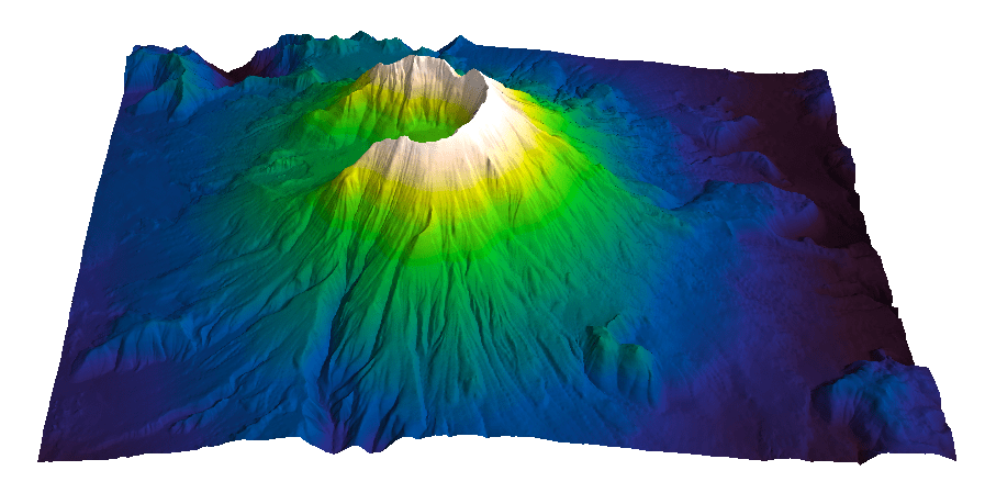
Evan Bianco of Agile Geoscience wrote a wonderful post on how to use python to import, manipulate, and display digital elevation data for Mt St Helens before and after the infamous 1980 eruption. He also calculated the difference between the two surfaces to calculate the volume that was lost because of the eruption to further showcase Python’s capabilities. I encourage readers to go through the extended version of the exercise by downloading his iPython Notebook and the two data files here and here.
I particularly like Evan’s final visualization (consisting of stacked before eruption, difference, and after eruption surfaces) which he created in Mayavi, a 3D data visualization module for Python. So much so that I am going to piggy back on his work, and show how to import a custom palette in Mayavi, and use it to color one of the surfaces.
Python Code
This first code block imports the linear Lightness palette. Please refer to my last post for instructions on where to download the file from.
import numpy as np
# load 256 RGB triplets in 0-1 range:
LinL = np.loadtxt('Linear_L_0-1.txt')
# create r, g, and b 1D arrays:
r=LinL[:,0]
g=LinL[:,1]
b=LinL[:,2]
# create R,G,B, and ALPHA 256*4 array in 0-255 range:
r255=np.array([floor(255*x) for x in r],dtype=np.int)
g255=np.array([floor(255*x) for x in g],dtype=np.int)
b255=np.array([floor(255*x) for x in b],dtype=np.int)
a255=np.ones((256), dtype=np.int); a255 *= 255;
RGBA255=zip(r255,g255,b255,a255)
This code block imports the palette into Mayavi and uses it to color the Mt St Helens after the eruption surface. You will need to have run part of Evan’s code to get the data.
from mayavi import mlab
# create a figure with white background
mlab.figure(bgcolor=(1, 1, 1))
# create surface and passes it to variable surf
surf=mlab.surf(after, warp_scale=0.2)
# import palette
surf.module_manager.scalar_lut_manager.lut.table = RGBA255
# push updates to the figure
mlab.draw()
mlab.show()
You can use the code snippets in here or download the iPython notebook from here (*** please see update ***). You will need NumPy in addition to Matplotlib.
*** UPDATE ***
Fellow Pythonista Matt Hall of Agile Geoscience extended this work – see comment below to include more flexible import of the data and formatting routines, and code to reverse the colormap. Please use Matt’s expanded iPython notebook.
Preliminaries
First of all, get the color palettes in plain ASCII format rom this page. Download the .odt file for the RGB range 0-1 colors, change the file extension to .zip, and unzip it. Next, open the file Linear_L_0-1, which contains comma separated values, replace commas with tabs, and save as .txt file. That’s it, the rest is in Python.
Code snippets – importing data
Let’s bring in numpy and matplotlib:
%pylab inline
import numpy as np
%matplotlib inline
import matplotlib.pyplot as plt
Now we load the data. We get RGB triplets from tabs delimited text file. Values are expected in the 0-1 range, not 0-255 range.
which is the format required to make the colormap using matplotlib.colors. Here’s the code:
b3=LinL[:,2] # value of blue at sample n
b2=LinL[:,2] # value of blue at sample n
b1=linspace(0,1,len(b2)) # position of sample n - ranges from 0 to 1

# setting up columns for list
g3=LinL[:,1]
g2=LinL[:,1]
g1=linspace(0,1,len(g2))

r3=LinL[:,0]
r2=LinL[:,0]
r1=linspace(0,1,len(r2))

# creating list
R=zip(r1,r2,r3)
G=zip(g1,g2,g3)
B=zip(b1,b2,b3)

# transposing list
RGB=zip(R,G,B)
rgb=zip(*RGB)
# print rgb

# creating dictionary
k=['red', 'green', 'blue']
LinearL=dict(zip(k,rgb)) # makes a dictionary from 2 lists
which gives you this result: Notice that if the original file hadn’t had 256 samples, and you wanted a 256 sample color palette, you’d use the line below instead:
Last week I went on a helicopter ride with Gerry, my father in-law, to count of Kokanee Salmon in the Camp Creek near Valemount, BC. We were invited by Curtis Culp of Dunster, BC, which is in charge of this conservation effort run by BC Hydro. Here’s a picture of Gerry leaving the chopper (from Yellowhead Helicopters).
Kokanee salmon is a land-locked relative of Sockeye salmon. This means that they spend all their life in inland lakes, never seeing the ocean. For spawning they enter inlet streams of the lake where they live. Camp Creek is a smaller tributary of the Canoe River, inlet of the Kinbasket Lake, where these Kokanee live.
The number of fish is estimated visually from the helicopter using a hand-held tally counter (every ~100-fish patch is a click). As a matter of facts, Curtis and Gerry counted fish, and I went along for the fun. Their estimates were really close, coming in at 15,000 and 15,400 in ~35 minutes over a ~15 km stretch of the Camp Creek. I counted 15 between Bald eagle and Golden eagle, and took some photos. Here they are!
Wildlife and nature photos
The first two are photos looking straight down the Camp Creek. Believe it or not, there’s fish there. See the dark spots? Those are Kokanee Salmon. And the job was to count them, so I am glad I did not have to (although it was easier to the naked eye).
The next two are a couple of photos taken at the ground level, courtesy of Curtis. Here the salmon is easy to see.
The next two are also photos of the creek from the helicopter. There’s fish in there but I can only say it because I saw them, I can’t quite make them up in the photos. I love the shots though, the crystal clear water and the shadows.
The following two are photos with eagles. I could not believe how tiny they look, since even at this distance they seemed huge to the naked eye. There is a bald eagle in the first photo (middle left) , the other two (in the middle of the second photo) are too tiny, it is hard to say.
This last one is a photo of the trees, just looking down. I find it mesmerizing.
Upon looking at all the photos (I took about 80) I have to say that as much as I love my iPhone 4S, they are not nearly as good as I had wished for. Certainly far from the photos I shot during a claim staking trip in the Cassiar Mountains near Watson Lake, Yukon using a Canon FTb 35 mm (one of these days I’ll have to get those photos out of the attic and publish some of them). I often think of going back to my reflex camera, although I hear the iPhone 5 camera is a big improvement, with the iPhone 5S being even faster, so there’s hope.
Bonus photo
Here’s a beautiful elk. I took it another day, on the highway just outside of Jasper, but I thought it would fit in here.
Geology photos
I love meander rivers so I took a whole lot of photos of the creek. The first one shows a nice sandbar right where we started the counting.
This next one is a nice shot of the meandering creek looking back.
In this third one you can see two nicely developed meander loops with point bars.
Last, but not least, a really tight meander. I love this photo, it’s my overall favourite.
Human activity photos
I am also including some photos showing the human footprint on the land. This first one is a clearing – I am not certain for what purpose, likely a new development. The circular patches are places where the logs were collected and burned. Quite the footprint, seen from here.
Next is something I did not expect to see here, a golf course – although I probably should have…. they are omnipresent, and often obnoxious, to say the least.
This is one I quite like: the creek, the railway, and the Yellowhead highway, all running next to one another.
The team
Finally, a shot of Gerry and I in the back of the chopper and one of Gerry counting.
In my post Our Earth truly is art I talked about Earth as Art, NASA’s e-book collection of wonderful satellite images of our planet, and posted my top 3 picks.
Take a look at the photo below, which I took it on the way up to McBride Peak (in McBride, British Columbia). It is a view up the Sunbeam Creek, part of an Ecological Reserve. Question: why would (only) part of the creek be so white? My father-in-law and I had been wondering since a previous hike to the top of the Peak, and speculations were running rampant. Finally, yesterday, we decided to hike up to the top again, then go down to the creek to find out. I think we did, and it was a great hike and a lot of fun. I am in the process of writing a nice post on this geo-adventure, but I though in the meantime I’d post the photo and make it a quiz.
I will give readers two clues:
1) the mysterious white “stuff” sits in a creek where water is actually running;
2) this is a south face, exposed to the sun all day long, so it couldn’t be snow or ice.
Below is a close-up photo. So, what do you think it is?
Or at least, what do you think it could be?
There’s something about tiled floors (and tiles in general) that has always mesmerized me and this is a really good one. I like the unusual perspective too.
There’s a radial pattern and a circular pattern of tiles, but if I stare at the photo I also see hints of an interference pattern, an intriguing flower pattern. I think this is a genuine Moiré pattern, one quite well known to photographers, generated by interference between circles of varying distance with the camera’s sensor pixel grid.
In my next post I will look in more detail at Moiré patterns and try to explain how they form.
I will show how the effect can be removed, or at least reduced, particularly from scanned images. Similar techniques can be used to remove acquisition footprint from reflection seismic data, which will be the topic of an upcoming series on MyCarta.
Over the last couple of years I have looked at a number of apps of all sorts. Some were seismometers. Out of those, two had the desired (to me) 3-component recording and export capabilities: Seismometer by Yellowagents, which is for for iPhone, and Seismograph alpha by Calvico, which is for Android and it’s the one I am talking about in this post.
These are several screen captures from Seismograph’s download page.
seismograph alpha
This looked good, so I downloaded it, and played with it a bit.
Functionality
You can change the color of the three components in the settings. I moved away from the default green, red, and blue (below, left) since the green and red can be confusing for color blind viewers, and used magenta, green, and black, which are less confusing (below, right). I also switched from black to white background and increased the saturation of the new colors.
You can also change the recording sensitivity on the fly with the pinch, see below.
Really cool. But after the initial excitement, I moved on. Because really, how many times can you tap the phone from every possible direction, export the data, load it in Excel, stare at it for a while, show it to your colleagues at work, and friends and family at home?
Here comes the dynamite
I recently had an opportunity to go back to this app and record some real data from a dynamite blast in a construction site!
Next to my office in Stavanger they have been building a new condo complex (personal note: as I publish this I am no longer in Stavanger, I moved back to Canada). Of course this being Norway, they soon had to deal with granite, and a whole pile of it.
OK, perhaps not so much rock and not as much as 25 tons of explosive at once, but you can see in the picture below (from Google Street view) that there’s a good amount of rock outcropping behind the parking lot and to the right of the car (and underneath it).
before
All that rock had to go, and so it is that for more than 3 weeks, there were a couple of charges shot every day. This is very good as once I set my mind on recording one shot, it took me a few experiments to get the setup right. But before I get to that, here is a photo I took a few weeks after the works had started, right after I recorded the shot I am using for this post.
after
The next two photos below show, respectively, one of the several excavation fronts, and the big pile of granite removed.
Looking at the excavation front
….
The big pile
Recording of the raw data
As I said it was good there were so many shots as it took me some time to get the right setting and a good recording. The two biggest issues were:
– the positioning of the phone: I started in my office, first placing the phone on the window sill, but I soon realize the ‘coupling’ was not so good as the sill was aluminum and a bit shaky. The floor was a lot better, but I finally tried on cement in the parking lot outside of the building, which proved even better.
– the phone lock: I figured out that the recording stops when the phone locks and it is resumed when you unlock it. The first time this happened right before the shot, which I lost. Also, having to touch your phone to unlock it while recording will result in the recording of a very noisy section.
I finally got to get a good recording. Here’s the raw data for those readers that may want to play with it.
Manipulating the data
This is the part that took me a bit of work. The first thing to do is to generate a time vector from the recorded date column. This is a fairly common task when working with field data. In the code box below I added the first 50 rows of time data. The date, which I called calendar time, in the second column. The first column, with sample number, was not in the recorded data, I added it here for reference. The third column is the output time vector, which is cumulative time. To get to this result I copied the milliseconds only from the calendar time column. I used UltraEdit, my favourite text editor, which allows to work with columns and column portions, not just rows.
Then I used a MS Excel formula to generate the cumulative time vector. Once I got to this I recognized that the sample rate is variable. I added a column called dt, which is the difference between pairs of consecutive samples, to make it more clear. I am not too sure if THIS is a common occurrence or not. In my MSc thesis worked with ORION land seismometers equipped with three-component geophones and had to correct for drift and with dead time (a short interruption in recording every minute due to GPS clock updates) but not with uneven sample rate. Has anyone seen this before?
To get around this I decided to resample the data, which I did in Matlab.
I used a new sample rate of 10 ms after taking the average of all values in the dt column, which turned out to be almost exactly 10 ms. I suspect this may be the ‘nominal’ sample rate for the app, although I could not find confirmation of this anywhere.
Here’s the interpolated time vector (although it is not really interpolated), which I used to resample (this time there was actual interpolation) the x,y, and z components. For those interested, here is the final ASCII file with interpolated x,y,z,time.
First quick look
Below is a plot of the data, which I generated in Matlab. There are two sections of high signal in all three recorded components. The first one is at the beginning of the recording, and it is due to the phone still moving for a couple of seconds after I touched it to star the recording. The second section, right after 2 x 10^4 ms, is the recorded shot.
Future posts
That’s it for this post. In my next post or two I will take a closer look at the data: I will use a tap test to assess polarity, will run a spectral analysis, and try hodogram plots, and hopefully much more.
For getting maps and art together, I thought it could not be topped. Then today, I stumbled into NASA’s Perpetual Ocean animation: beautiful!
From the original Source: This is an animation of ocean surface currents from June 2005 to December 2007 from NASA satellites. Watch how bigger currents like the Gulf Stream in the Atlantic Ocean and the Kuroshio in the Pacific carry warm waters across thousands of miles at speeds greater than four miles per hour (six kilometers per hour); how coastal currents like the Agulhas in the Southern Hemisphere move equatorial waters toward Earth’s poles; and how thousands of other ocean currents are confined to particular regions and form slow-moving, circular pools called eddies. Credit: NASA/SVS
Related sites
More media options, including a 20 minute version at 30 fps can be found here